Wilkinson Sword Enlists B&B Studio to Revamp Branding and Product Packaging
The rebrand cements Wilkinson Sword's role as the ultimate challenger to brand leader Gillette in the face of new market entrants and direct-to-consumer offerings.
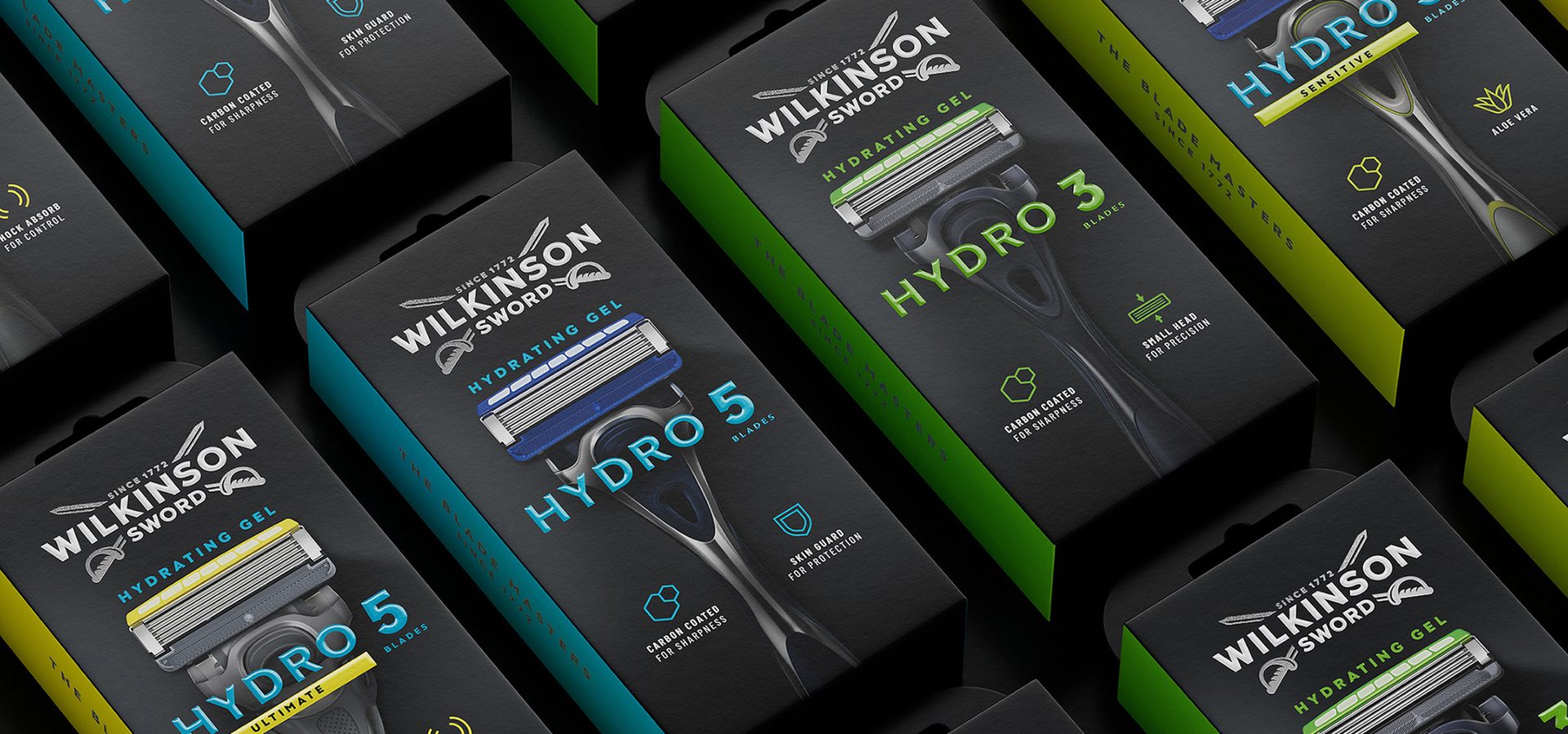
Wilkinson Sword uses subtle color markers to differentiate between its products.
B&B studio has partnered with Edgewell-owned Wilkinson Sword to rebrand and revamp its shaving and grooming portfolio, introducing contemporary design confidence while re-emphasizing the brand's unique heritage. The rebrand cements Wilkinson Sword's role as the ultimate challenger to brand leader Gillette in the face of new market entrants and direct-to-consumer offerings.
The Blade Masters since 1772
Working to a new brand positioning — The Blade Masters since 1772 — inspired by the brand's 250+ year history and sword-making origins, B&B studio began the project by recrafting Wilkinson Sword's iconic double sword logo. The new design moves away from the existing flat and one-dimensional graphic, introducing greater depth and character to the swords, and modernizing the logo's typography – including reworking the Ws with sharp and purposeful cuts. A new "Since 1772" tagline stresses the brand's longevity and expertise, adding quiet confidence to the execution.
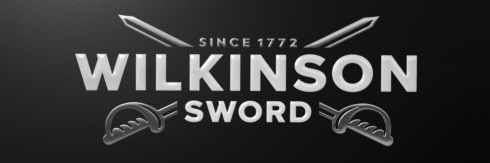
Recrafting Wilkinson Sword’s double sword logo was a top priority for B&B.
A Complex Portfolio
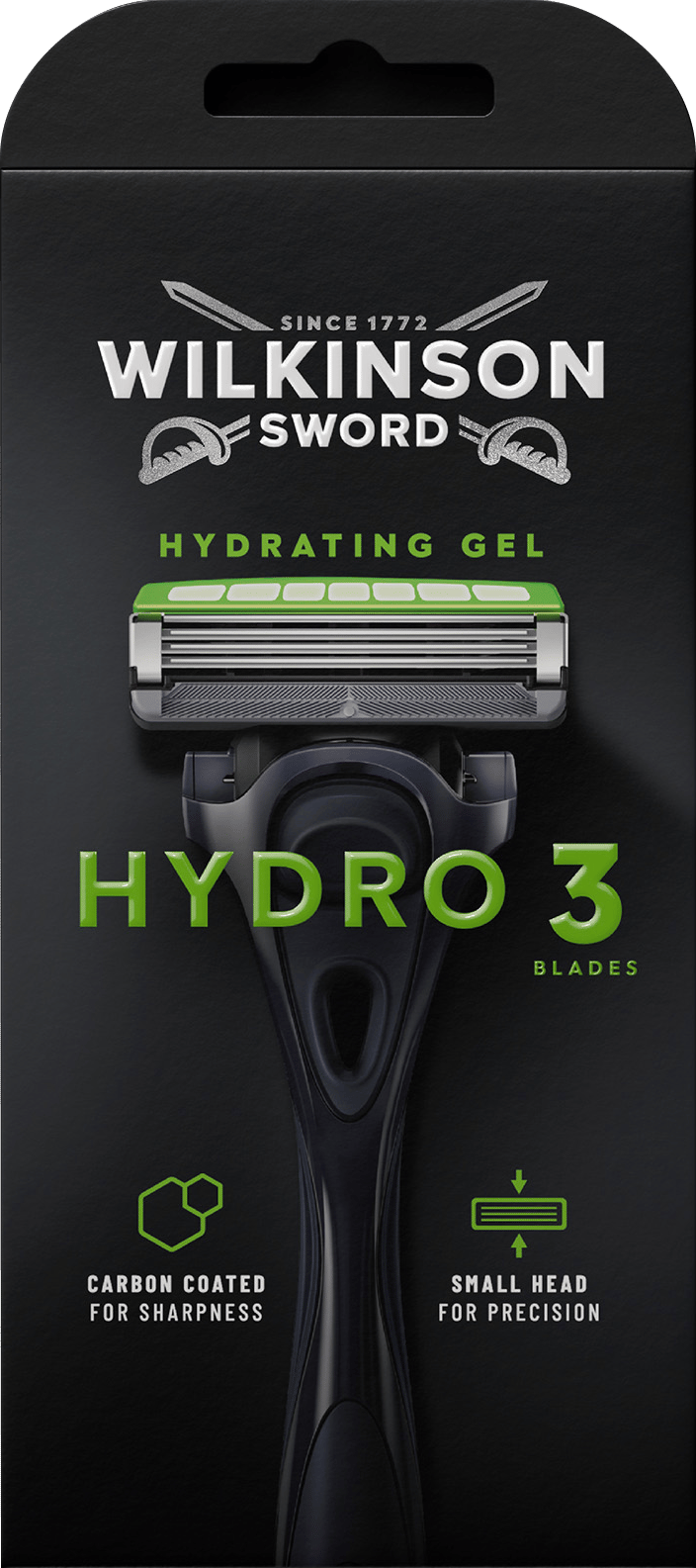
Bringing meaning and purpose to the brand's portfolio was the project's core strategic challenge. A new consumer-led architecture, inspired by The Blade Masters — focuses on expertise and introduces four distinct ranges across the brand's shaving and grooming products. This simplified system was created to help people find the right tools to achieve a more masterful shave.
With different SKUs available in different markets, it was essential to create an overarching family feel from a design point of view, so that any of the products could sit together. This has been achieved by introducing black as a core brand color across all ranges, and using color blocking, layout and typography to differentiate ranges, and variants within each range. Across all SKUs, product is put on a pedestal through hero imagery that clarifies what's inside.
A simplified communications system has also been introduced, with a clearer product naming, universal benefit-led iconography, and a consistent hierarchy, aiding navigation and making the brand's expertise instantly accessible.
Wilkinson Sword's Hydro range — the core razor offer — is the first of the new designs to launch onto the market, with further ranges to follow.
Contemporary Confidence
“Tackling the Wilkinson Sword portfolio has been an incredibly rewarding challenge,” comments B&B Design Director Jack Gibbons. “It is a privilege to partner with a brand so rich in heritage, and the new look emphasizes the brand's genuine quality and expertise in a cluttered marketplace.”
“B&B has successfully translated our new Blade Master positioning into a design that oozes contemporary confidence,” says Sophie Rock, Head of Wilkinson Sword Europe. “We can't wait to see the complete portfolio on display in stores.”
The rebrand helps Wilkinson Sword stand out in a crowded market.
The rebrand helps Wilkinson Sword stand out in a crowded market.