
Package of the Month
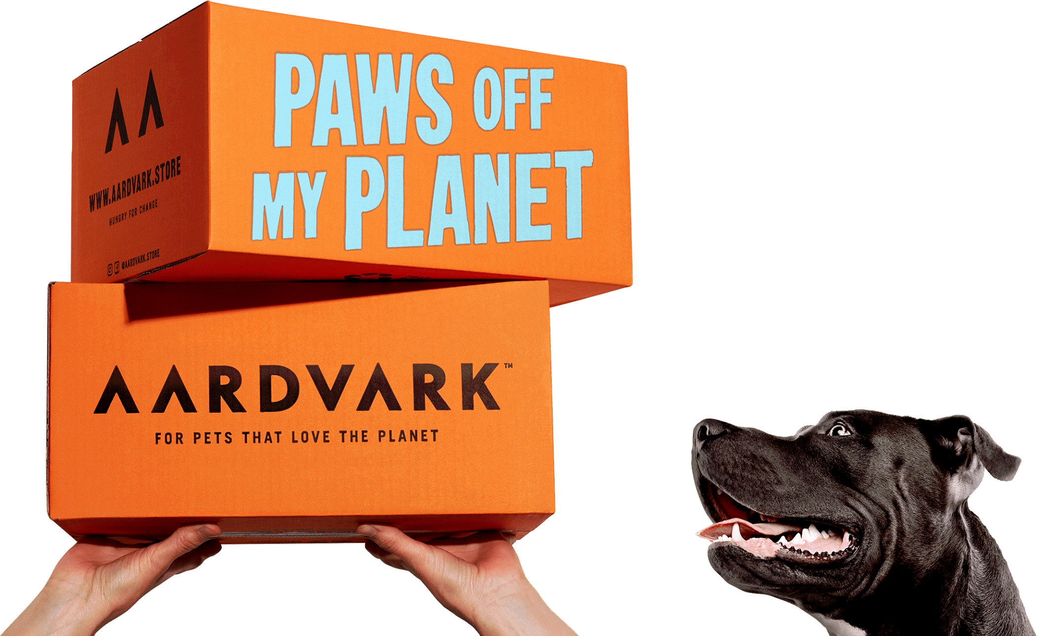
B&B Studio Creates AARDVARK, a Sustainable Insect-Based Pet Food
Aardvark is a new brand creation by B&B studio for young entrepreneur Hugo Walters, encompassing brand positioning, creative strategy, naming, brand design and packaging. A sustainable, vet-approved insect-based pet food for cats and dogs, Aardvark will launch initially as a DTC brand, with a retail offer on the way.
Aardvark’s mission is to help make pet ownership more sustainable. Pets eat an estimated 20% of the world’s meat, and feeding pets contributes up to a quarter of the negative environmental impact of meat production worldwide. And while 66% of millennials are increasingly turning to plant-based protein sources, they continue to feed meat to their pets — particularly cats, for whom a vegan diet is inappropriate. Insect protein is a sustainable and healthy solution to that problem — but it requires a shift in perception and a change of behavior for consumers.
Put off by the bug-based puns and insect illustrations common to the design codes of emerging insect-protein products, B&B knew it had to create a compelling and desirable lifestyle brand in order to galvanize and educate consumers. While the name Aardvark, created by B&B, offers a knowing nod to the insect-protein source, it also sets the stage for a witty and characterful brand personality — vital for a contemporary DTC, digital-first brand. By shifting the emphasis from ingredient to mission — as the brand that helps pets protect the planet — Aardvark aims to embody revolutionary zeal and begin to build a community of pet- and planet-lovers.
The Aardvark identity is a simple but impactful combination of vibrant color, linework illustration and a bold logotype. Playing on the pointed shape of pets’ ears, the logo makes the most of the double A at the beginning of Aardvark, creating a movable icon that can come to life in a host of applications off-pack.
Courtesy of B&B Studio
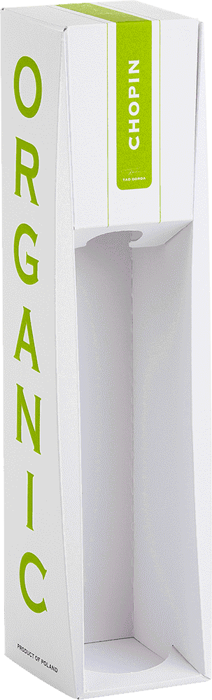
Metsä Board Designs Easy-to-Recycle Chopin Organic Vodka Packaging
For the family-owned distillery, Podlaska Wytwórnia Wódek “Polmos” S.A., that produces the Chopin Vodka brand, it was important that the packaging conveyed the brand ethos. Joanna Dolińczyk, marketing coordinator, Chopin Vodka brand explains, “When we were looking for inspiration for the packaging design of our organic product, we wanted to ensure that the packaging reflects its organic production process. Our vision was to create a truly organic and highly ecological packaging included three main goals: purity, whiteness and simplicity.”
The packaging is manufactured using a protective F-flute, with all layers made of lightweight MetsäBoard Natural WKL Bright white kraftliner. The all-white litho-laminated packaging has a light and robust structure based on locking flaps that require no glue. Combining a no-adhesive approach with minimal coverage of low-migration inks with water-based varnishing resulted in a package that is safe, stylish and easy to recycle. The packaging was manufactured by Prost-Key Packaging in Poland.
The opening mechanism allows the packaging to be opened and closed numerous times with ease while also locking the bottle into place. The curved double folds add strength and reveal the bottle when viewed from the side. The white outer package features the word "organic" embossed on the sides, emphasizing purity.
Iiro Numminen, structural packaging designer, Metsä Board, says, “The packaging communicates the brand’s promise to the consumer in every way, while the importance of the circular economy is evident with the ease of recyclability.”
The package was designed and tested at Metsä Board’s Excellence Center that utilizes cutting-edge technology for R&D, packaging design, and paperboard and packaging performance. Here the aspiration is to accelerate material and packaging innovation and provide a collaboration platform for customers and technology partners globally.
The packaging is manufactured using the lightweight MetsäBoard Natural WKL Bright white kraftliner, produced at Metsä Board Husum mill. Its fresh fibers are 100% traceable to sustainably managed Northern European forests.
Courtesy of Metsä Board
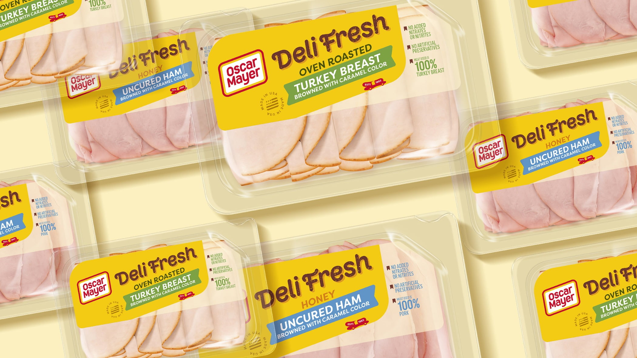
Oscar Mayer Rebrands Entire Product Line
The 138-year-old brand realized its products took on very different looks and tones within the brand’s portfolio as time went on and wanted to better reflect the world today. Here’s a look at what the company is changing: Updated logo and refreshed packaging designs from branding agency BrandOpus that cohesively feature the brand’s iconic “never square” logo shape. The branding/packaging updates highlight four distinctive design territories for the brand:
The Oscar Mayer rhomboid. The rhomboid’s movement and dynamism spark new joyful energy and serve as an iconic visual tool that creates cohesion across the entire portfolio.
Oscar Mayer yellow: This distinctive shade of yellow is featured prominently and drives recognition and distinctiveness across all brand touchpoints.
A custom typeface highlights the playful nature of the Oscar Mayer brand has been integrated into all packaging.
The Wienermobile. This iconic symbol will unite the entire portfolio of products while figuratively driving the brand forward into more modern times. These branding updates can also be seen in the brand’s new creative platform from global advertising agency Johannes Leonardo called “Keep it Oscar,” which invites everyone to see the world through meat-colored glasses and take life less seriously by reimagining meat in playful, unexpected ways.
Courtesy of Oscar Mayer
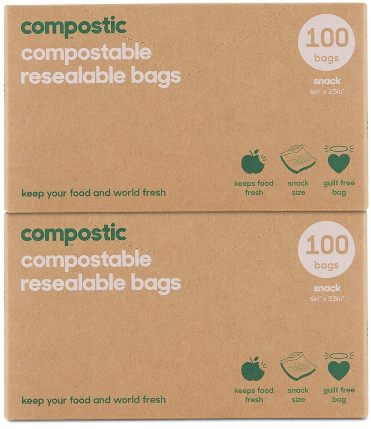
Compostic Launches Home-Compostable Cling Wrap and Resealable Bags
Compostic, a certified home-compostable plastic alternative brand based in New Zealand, announced its launch in the United States. With a mission to address the environmental catastrophe of plastic waste, Compostic’s performance compostables offer a guilt-free, 100% home-compostable alternative to traditional kitchen plastics that are zero-waste, from the product to its packaging. In addition to the products’ sustainable qualities, Compostic’s materials aim to offer high-quality elasticity and strength to match the performance and functionality of traditional plastic, providing a simple solution to going plastic-free without compromise.
Founded by Jon Reed in 2018, Compostic was created to eradicate the need for common, single-use plastics from the home while maintaining the convenience of traditional plastics. After years of development, Compostic’s product line includes proprietary Cling Wrap and Resealable Bags that offer guilt-free, vegan-friendly and certified home-compostable plastic alternatives to consumers. Both products are FDA-approved, BPA-free, non-GMO and non-toxic, providing the functionality of traditional cling wraps and ziplock bags. Unlike common plastics, Compostic’s materials will break down in a home's compost in 12-24 weeks, faster than an orange peel. In addition to Compostic’s products being 100% compostable, the brand’s packaging can also be recycled.
“My inspiration behind Compostic began with my realization of the massive threat that plastic has become to our environment,” says Reed, founder and CEO of Compostic. “It soon became my life’s mission to find a sustainable solution to the convenience that plastics have within our lives, but that won’t stick around polluting our environment for hundreds of years. We are thrilled to launch Compostic in the U.S. as we continue our mission to eliminate single-use plastics on a global scale. We believe that with Compostic’s alternatives, there is no longer an excuse to use toxic plastics anymore.”
Compostic is made from a compound of biopolymers designed to mimic traditional plastics in functionality. The brand claims its Cling Wrap is the world’s first home-compostable cling wrap that is entirely zero-waste, while matching the elasticity and quality of traditional plastic cling wrap. Aside from the sustainable properties of the Cling Wrap itself, the product’s packaging is free from any metal or plastic cutters and features soy-based inks and a recyclable and compostable box. The wrap incorporates pre-perforated markings for seamless use and is available in 150-square-feet and 250-square-feet lengths.
“We understand few consumers are willing to sacrifice quality to purchase the most environmentally friendly option,” says Reed. “Because of this, we spent years carefully developing our performance compostable materials that function just as well, if not better, than their plastic equivalents. Our compostable Cling Wrap is as clingy as it is guilt-free, and our Resealable Bags are stronger than traditional plastic. We look forward to introducing Compostic to U.S. consumers and helping them seamlessly transition to a more sustainable lifestyle.”
Courtesy of Compostic
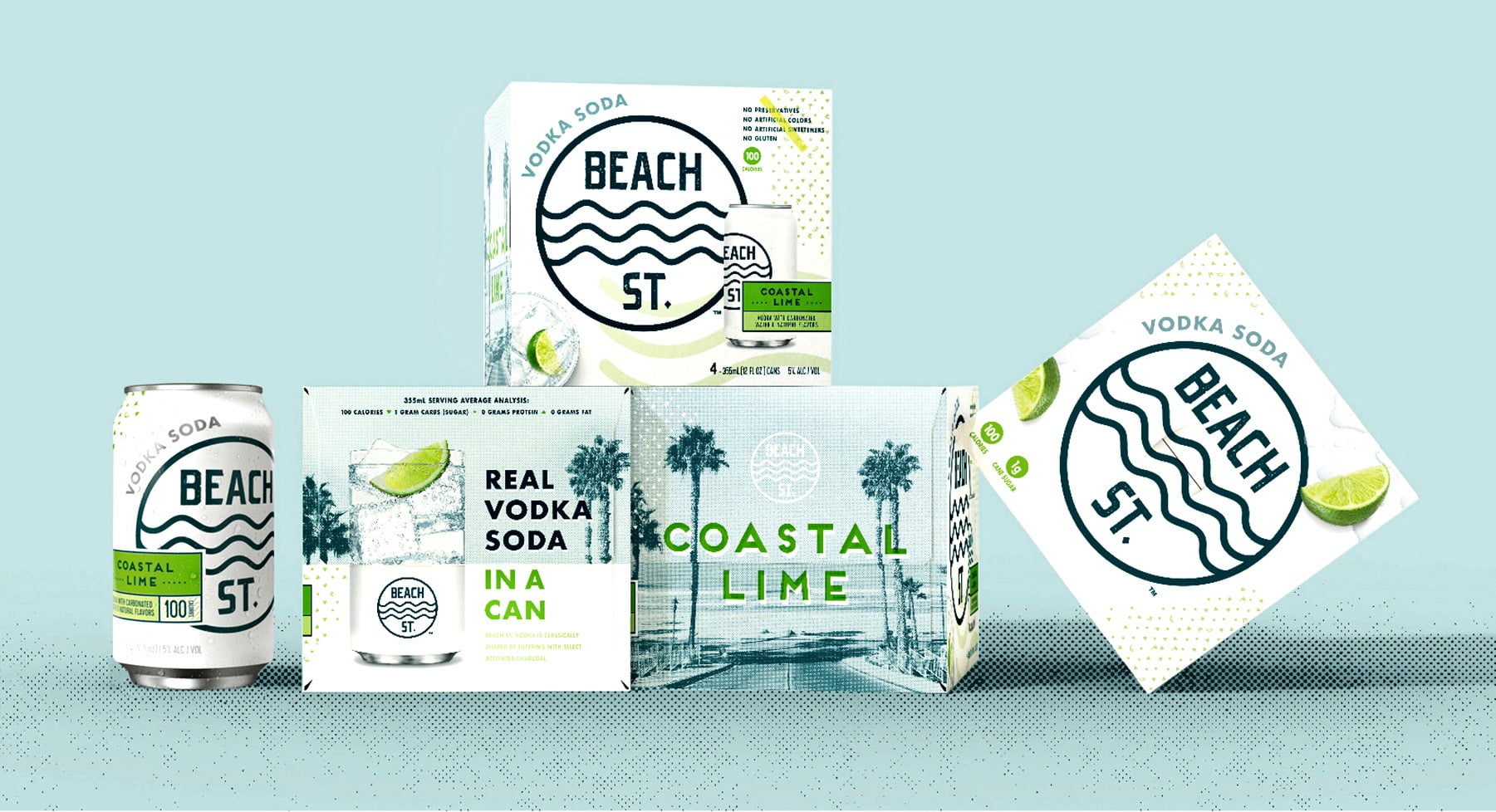
New Beach St. Vodka Cocktail Evokes the Sand, Sea and Sky
It’s always summer on Beach St., which is why beach vibes and sun-drenched coastal signage inspire the look and feel of packaging for the new Beach St. Vodka Soda beverage from Christopher Michael Brands. Beach St. is sold in cans with an outer cardboard box.
Created by Chase Design Group, Los Angeles, the logo consists of simple, linear waves and a modern sans serif font, reminiscent of familiar beach signage but also serving as a mnemonic device. The blue logo represents the ocean while the pure white background communicates the purity of the product. Central to the focus of the design, it creates a memorable image in a sea of hard seltzers. With 1g of cane sugar, no preservatives, no artificial colors or sweeteners, no gluten and 100 calories per can, Beach St. is positioned as a better-for-you alternative.
"As a new entry in the market, Beach St. needed to communicate its major point of difference, that it’s vodka-based, not beer,” says Dave Carlino, senior design director, Chase Design Group. “The name, the logo, and the supporting graphics and language all work together to communicate a refreshing drink fit for a sun-soaked afternoon. The large logo pops off the white package while 'Vodka Soda' is clearly called out on both the can and the outer box.”
Refreshing, appetizing visuals on the outer pack include a half can/half cocktail glass graphic while the front of the pack features an overhead image of an icy cocktail glass garnished with flavor cues indicating the four choices: Coastal Lime, Cranberry Splash, Ruby Red Orange and Glacier Berry. Vintage California lifestyle photography completes the simple, refreshing vibes.
According to Stephen Goodridge, co-founder, Christopher Michael Brands, “Our collaboration with Chase Design Group resulted in a fun and memorable design that pays tribute to the classic California style while also communicating the superior quality of Beach St. over other hard seltzers.”
Courtesy of Chase Design