
Orchard Valley Harvest Unveils Purpose-Led Packaging Redesign
New packaging spotlights connection to charity partner Conscious Alliance and other organizations tackling food insecurity.
By Brad Addington
Nut industry leader John B. Sanfilippo & Son has relaunched its Orchard Valley Harvest (OVH) brand, with an identity and packaging developed in partnership with global brand design agency Straight Forward Design.
The OVH brand of nuts, dried fruits and mixes has faced challenges in recent years, with increasing pressure from own-label and competitor brands using similar names, colorways and functional claims around simple, natural goodness, meaning that it was no longer differentiated in a highly competitive marketplace.
Straight Forward Design has partnered with John B. Sanfilippo & Son to revolutionize the OVH brand, bringing it into the 21st century with a new purpose-led identity which has the potential to disrupt the category.
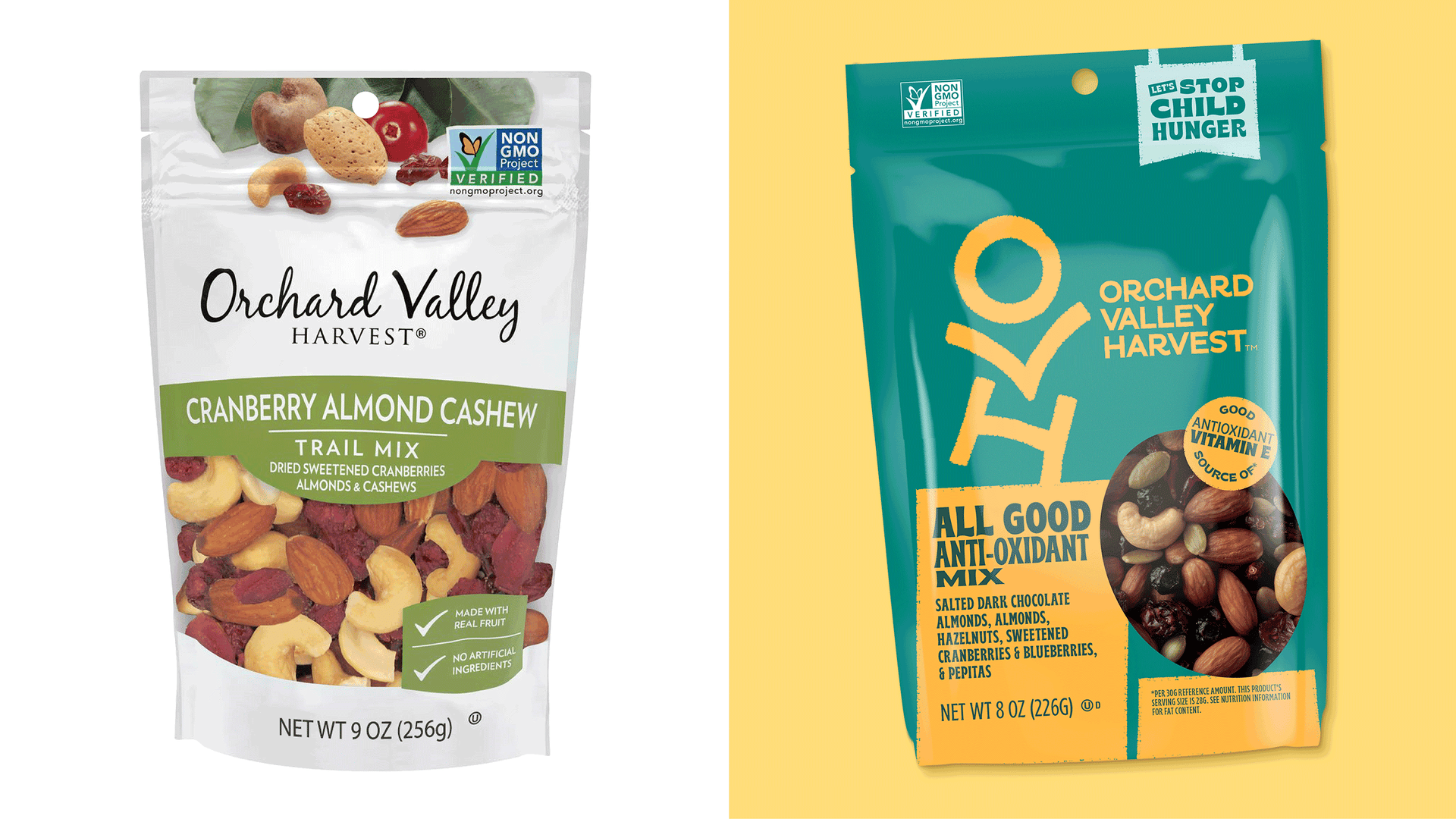
Before (left) and after (right) of Orchard Valley Harvest’s packaging redesign
Straight Forward Design worked to create a visual identity and design expression which would resonate with Gen Zs and Millennials, both of which are high growth target audiences in the healthy snacking space.
The new brand aims to be more approachable, making the healthy snacks accessible for as many people as possible. It features a new brandmark which uses the letters OVH to form a playful, positive character, and a bright color palette inspired by the real colors of nature and the brand’s tasty flavor combinations. Supporting typeface Bryce captures the fun and variety of OVH.
The new packaging features a purpose message (“Let’s stop child hunger”), with a proportion of profits going to charity partner Conscious Alliance and other organizations tackling food insecurity, as well as simplified on-pack information which is more easily navigated than its predecessor.
Orchard Valley Harvest has unveiled a series of slogans to help bring awareness to child hunger.
The rebrand is initially launching on packaging, in-store and across digital and social channels. A supporting above-the-line marketing campaign by Terri and Sandy is planned for later this year.
Colleen Conrad, Brand Marketing Director, John B. Sanfilippo & Son, said: “Straight Forward Design have revolutionized a brand which had become lost in a sea of similar brands. The new OVH graphics really pop off shelf, as validated by our quantitative consumer learning. But we’re excited to see the brand come to life in store.”
Mike Foster, Founder and Creative Director, Straight Forward Design, added: “In a crowded category where everything looks the same, we wanted to create something different. We believe the new OVH brand, which has purpose at its heart and a playful, approachable look and feel, is well-placed to cut through and become the healthy snack of choice for Gen Zs and Millennials across North America.”