
Package of the Month
Mother Design Creates Bold Brand Identity for Biodegradable Gum
UK-based startup brand Nuud is aiming to rid the world of the polymer contained in conventional, synthetic chewing gums. “Most people don’t know that regular chewing gum is made of single-use plastic and isn’t compostable. UK councils spend around £60 million a year cleaning up gum from our streets. We want to tackle this and effect a wholescale change in behavior when it comes to chewing gum,” says Keir Carnie, founder of Nuud. “Our brand is designed to encourage this shift in a fun and engaging way. Made from the sustainably harvested tree sap chicle, Nuud gum decomposes as quickly as a banana skin — we want to bring this biodegradable choice to a mass audience.”
The brand identity and visual execution, created by Mother Design in collaboration with Carnie, reinforces the brand’s personality, energy and messaging. It is guided by the core sentiment of “fearless, fun, transparent and eco” and the unapologetic strapline of “chew plants, not plastic!” The key elements of the identity include a logo inspired by a clean, happy mouth. It is complemented by a friendly and playful mascot — gender-neutral Charlie, designed by South Korean illustrator Daye Kim — to lend the brand a strong, approachable personality.
“With the inherent brand message and mission of changing chewing gum behavior, it was important that the brand didn’t come across as militant or patronizing,” explains Thomas Humeau, design director at Mother Design. “Nuud is tackling a serious issue but doesn’t want to come across as too authoritative. Inspired by other food categories that often make use of a mascot, we introduced Charlie to help the brand communicate its passion and inform users with levity.” The color choices have remained true to cues within the gum category (blue for peppermint, green for spearmint), but the palette also includes a neutral grey as a platform for more campaigning or informative communications.
Carnie adds, “The visual identity perfectly expresses the brand’s personality and message — it has helped make the product universally appealing and accessible. Best of all, it makes our product stand out and feels instantly iconic. I have no doubt that showing our design helped convince some of the UK’s favorite retailers to buy into our proposition, supporting our mission of ridding our streets and planet of synthetic gum.”
Courtesy of Mother Design
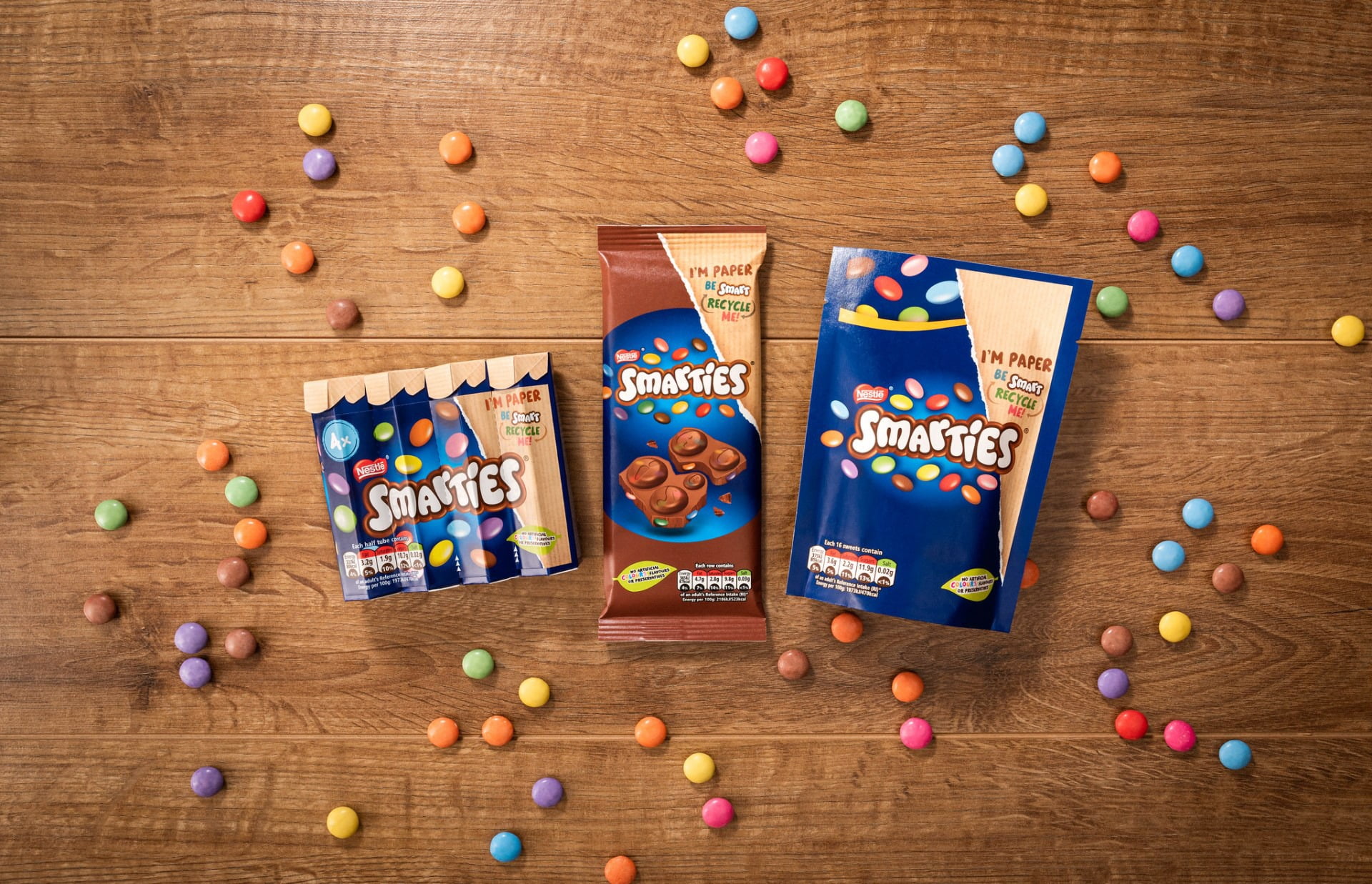
Nestlé Australia Partners with Amcor to Put Smarties in Sustainable Packaging
Amcor recently partnered with Nestlé in making Smarties the first confectionery brand to move to recyclable paper packaging in Australia.
The new packaging, made from sustainably sourced thermoformable paper, can be printed using either flexographic or gravure technology and finished with a heat or cold-seal adhesive. The new packaging technology with its various applications is used across the Smarties chocolate block and bar product range, is fully recyclable and can go in home recycling bins.
Simon Roy, V.P. and general manager, Amcor Flexibles Australia & New Zealand comments, “As a diversified packaging company, we’re focused on delivering the most sustainable packaging possible — while also ensuring product protection and customer convenience — to help our customers meet end consumer needs. This new range of packaging reaffirms our commitment to ensuring all our packaging is designed to be recyclable or reusable by 2025.”
Courtesy of Amcor
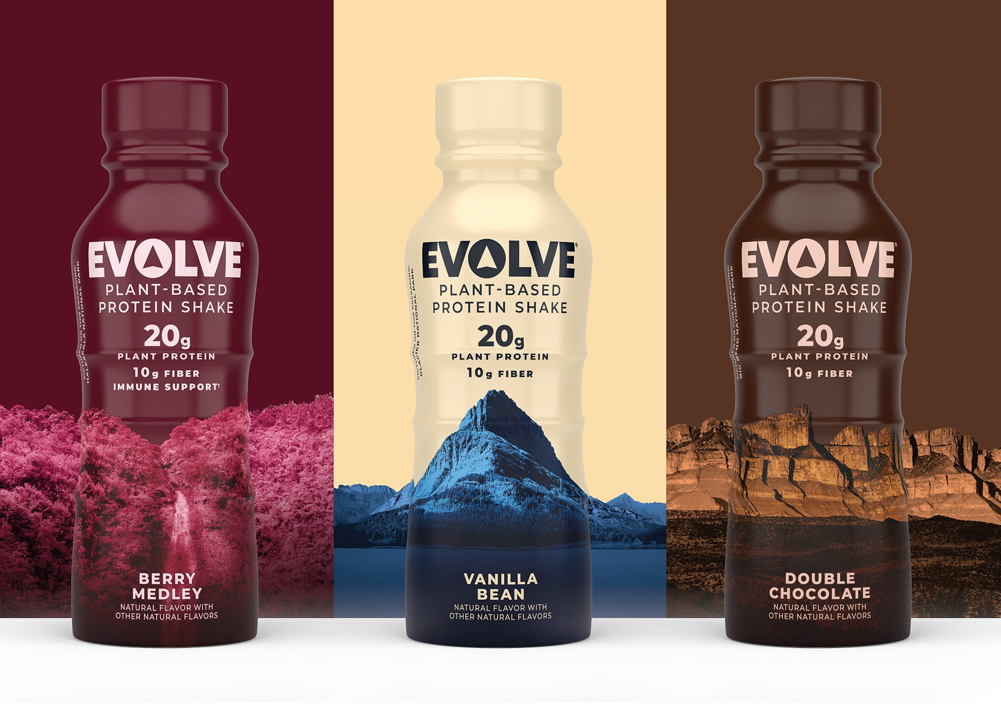
PepsiCo Relaunching EVOLVE Brand
The reimagined portfolio includes reformulated plant-based protein shakes and new flavors with new packaging from the company’s in-house design team. Inspired by the diverse beauty of the National Parks, each Evolve flavor is packaged in a bottle designed to celebrate a national park by showcasing its uniqueness (Double Chocolate celebrates Big Bend National Park, Vanilla Bean draws inspiration from the Glacier National Park, Berry Medley celebrates Hawaii’s Haleakalā National Park, Café Mocha spotlights Rocky Mountain National). The arrow in the center of the “O” represents finding your true north, while the triangle shape language communicates outdoors and adventure. Abstract imagery of naturally occurring textures and structures connotes taste appeal by drawing parallels to the patterns and colors found in each EVOLVE flavor. “With the EVOLVE brand redesign, we wanted to create something differentiated for consumers who derive energy from staying active and getting outdoors,” says Matthieu Aquino, VP of design, global beverage & brand experience. “The new visual identity and redesigned bottle invite the feeling and experience of the outdoors, while also communicating our ongoing support of the National Park Foundation.”
Courtesy of PepsiCo
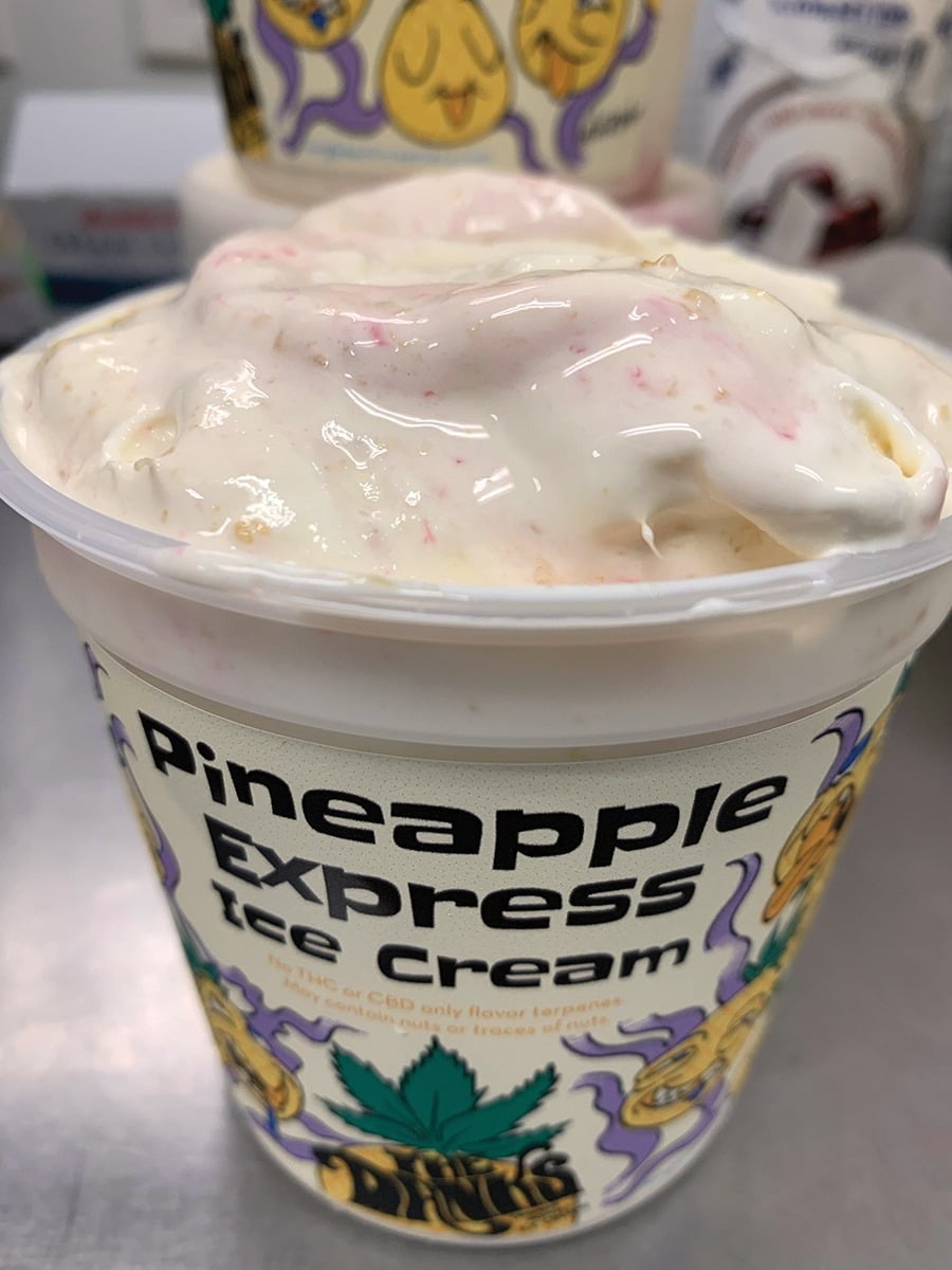
Long Beach Creamery launches Line of Cannabis-Inspired Ice Creams
Long Beach Creamery has launched the Danks, a line of cannabis-inspired ice creams. The Danks ice cream does not contain THC or CBD, but it does contain the terpene profiles of the cannabis strain with some extra shop-made mix ins to accentuate the flavors which include: Blue Dream, Pineapple Express, Granddaddy Purp and OG Kush Chip. Terpenes are the building blocks of aroma and scent in all plants, used everyday in bath oils, flavor extracts and now cannabis-flavored ice cream. The Danks launch showcases pint label designs from Long Beach artists including: Corey Wolford, Jason Keam, Kate Maleki and Mike R. Baker, who were each commissioned to design a Danks flavor label.
Courtesy of Long Beach Creamery
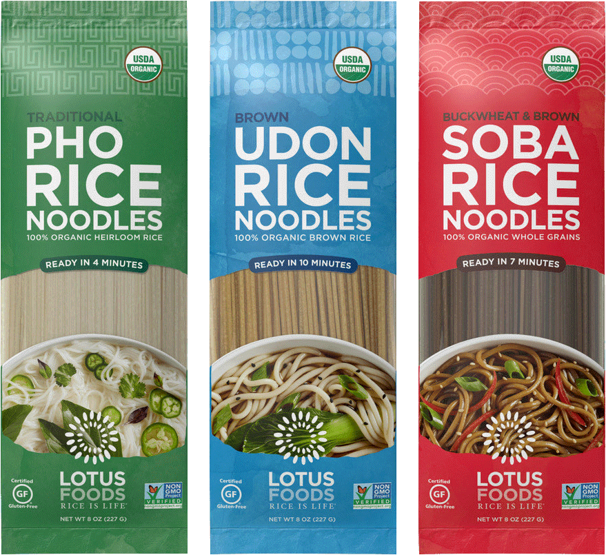
Lotus Foods Expands Asian Rice Noodle Offerings to Include Pho, Udon and Soba
The three new noodle styles build on the success of Lotus Foods' line of organic rice Pad Thai noodles and better-for-you rice ramen noodles. Sales of Asian noodles have increased significantly over the past year as consumers look for more variety, flavor and convenience in their weekday menus. "We're excited to offer our twist on even more popular Asian noodles to give cooks flavorful options that are whole grain, gluten-free and easy to get on the table. As people experiment with new cuisines at home while keeping health and wellness at the forefront, we've seen the popularity of our rice noodles soar," says Caryl Levine, co-founder/co-CEO of Lotus Foods. "With 90% of consumers saying organic is more important than ever, Lotus Foods is filling a need in American pantries through a modern take on noodles." Lotus recently released Heat & Eat Rice Pouches and in 2020 the company expanded its Rice Ramen Noodle Soup Cups to include a Spicy Kimchi flavor.
Courtesy of Lotus Foods