Helping a Cannabis Brand Set Sail
Distinctive package design from the creative team at BRIGADE agency sets Ocean Breeze Cultivators from the competitive cannabis category.
COLLABORATION
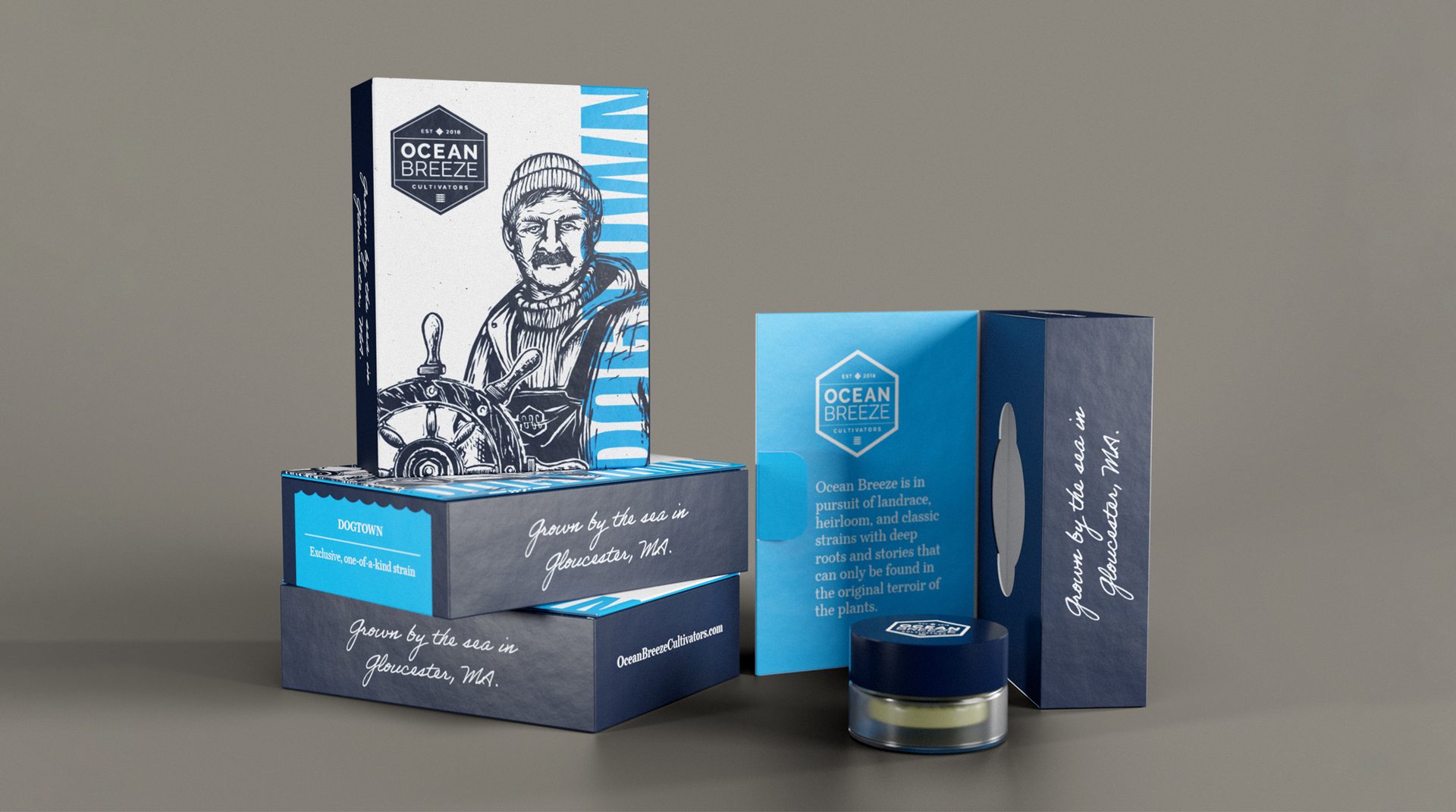
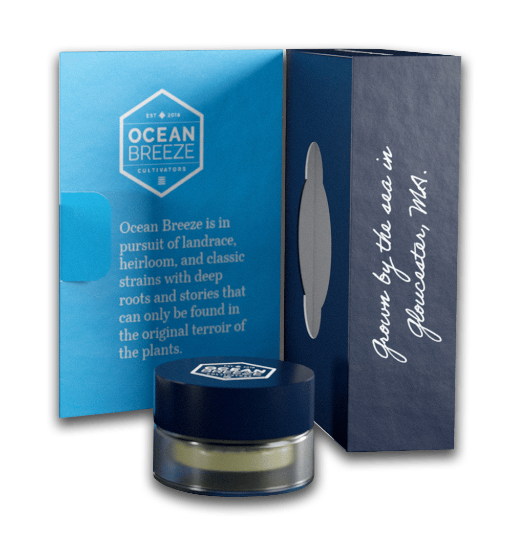
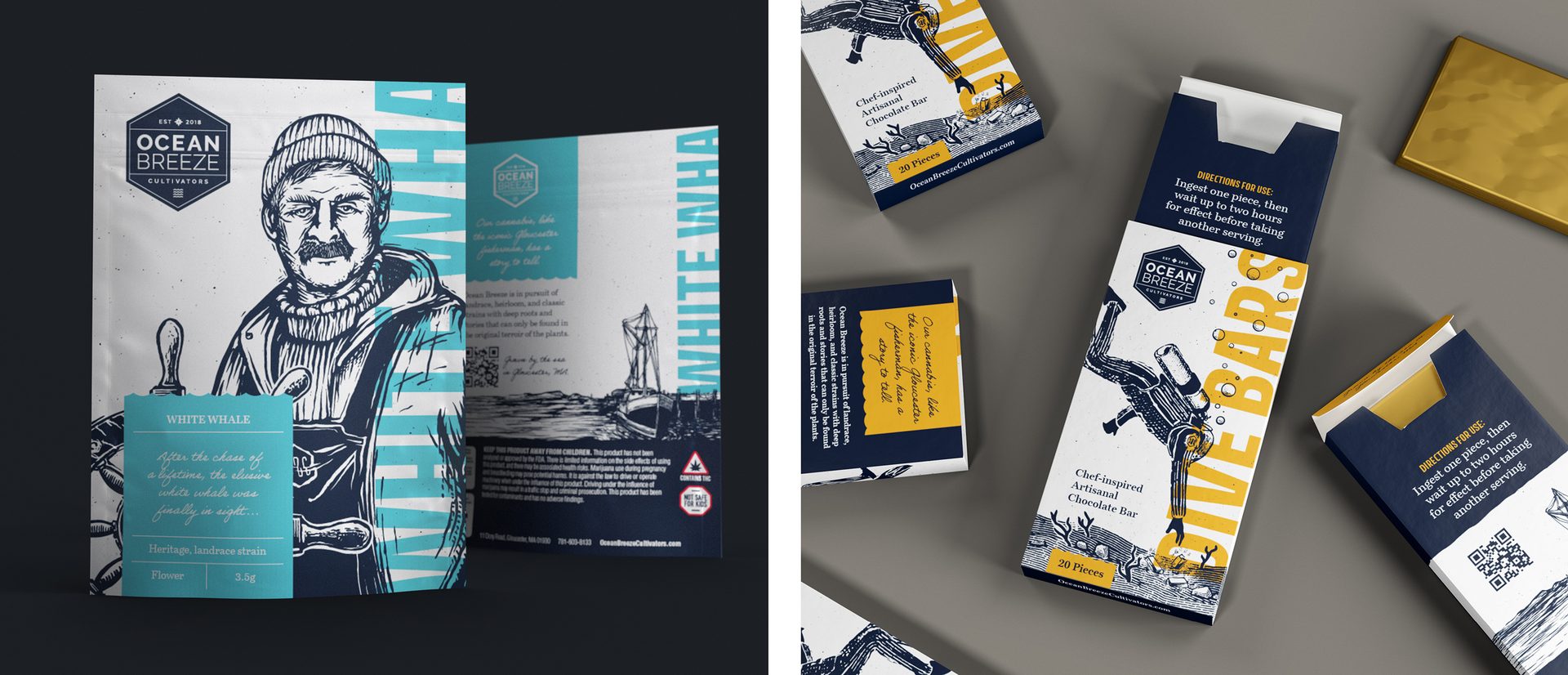
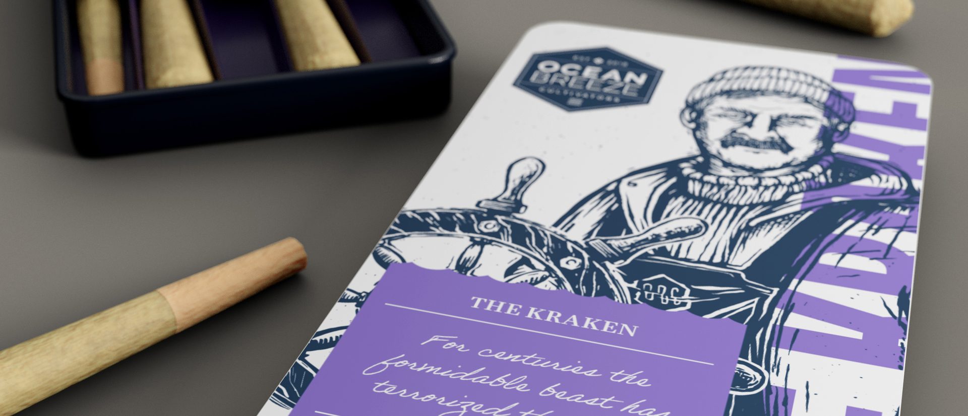
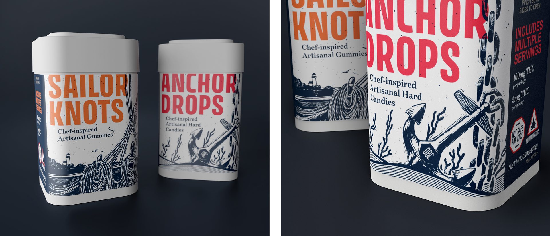
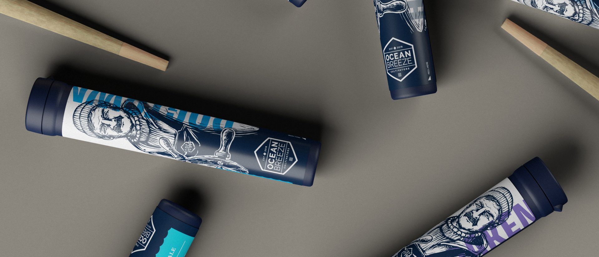
Ocean Breeze Cultivators came to BRIGADE for help launching their family-owned and run cannabis business. Based in Gloucester, Massachusetts, the heritage of this iconic port town became the foundation of the brand. After the agency developed positioning, messaging, and look and feel for the brand, it was time to move onto packaging — where the brand’s story was brought to life through an homage to the Gloucester fisherman, whose likeness became a graphic icon for Ocean Breeze.
APPROACH
The overarching goal for this assignment was to set the brand up for success in a saturated market, both in Massachusetts and across the country (once federal legislation allows). To do this, the team at BRIGADE developed stand out packaging with the fisherman as the focal point, using his likeness to represent the work ethic (and salty mentality) of the town’s people. Storybook-inspired copy ties the icon to the story of Ocean Breeze and provides experience cues for their products, while color changes clearly indicate different flower categories and large vertical type communicates the category name. In the end, the packaging not only pops on-shelf, standing out from the sea of sameness that exists in the cannabis space, but also perfectly embodies the Ocean Breeze brand, acting as a vessel for a quality product — grown near the sea in Gloucester, Mass.
Agency: BRIGADE
Client: Ocean Breeze Cultivators
Category: Cannabis
Providence: Massachusetts
Work Provided:
- Identity
- Packaging
- Sales Collateral
- Ongoing Brand Development