
Package of the Month
Wolfhead Distillery Becomes First in Canada to Implement Paper Bottle
The new paper-based packaging allows for a significant reduction in environmental impact.
Package of the Month
Wolfhead Distillery Becomes First in Canada to Implement Paper Bottle
The new paper-based packaging allows for a significant reduction in environmental impact.
Wolfhead Distillery has introduced its new release in the form of a Vanilla Almond Biscotti Cream Liquor in innovative paper packaging, making the craft distillery the first in Canada to ditch the glass for a 100% recyclable solution.
Developed in partnership with Kinsbrae Packaging (Cambridge, ON) the paper bottle is lightweight, carbon-friendly and 100% recyclable. This bottle uses 77% less plastic and has a carbon footprint 84% lower than a glass bottle. Its shape is similar to a wine bottle but five times lighter than glass.
Although the paper packaging exterior is eye-catching and a great step in eco-friendly diversity, what's on the inside is the true star of the show. The Cream Liquor is the first of its kind for Wolfhead Distillery, making this the tenth product they’ve launched since opening the doors in 2016. The cream is formulated with Wolfhead’s own Premium Whisky, natural flavor and dairy to create a smooth and distinguishable product worthy of an equally distinguishable bottle.
Wolfhead Distillery Facebook
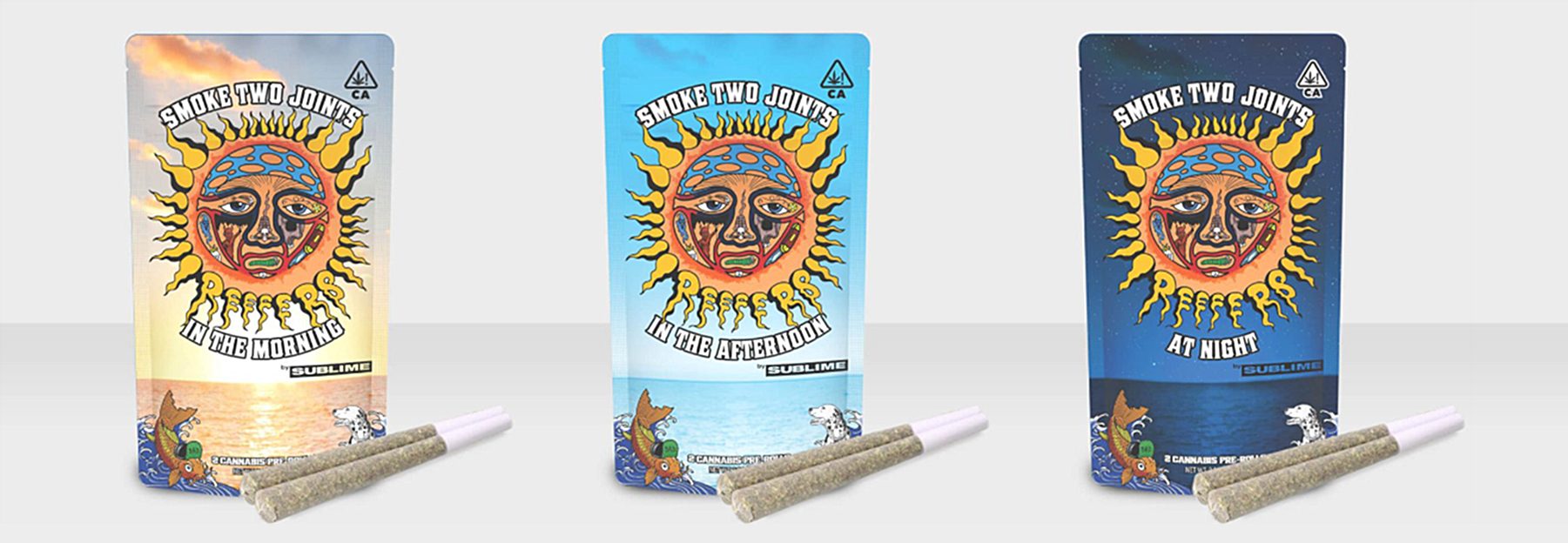
Elevated Global Supply Provides Mylar Pouch for REEFERS by Sublime
Elevated Global Supply (Elevated), a multi-national consumer packaging design and fulfillment company specializing in the cannabis industry, has partnered with Sublime for its newly released packaging for its REEFERS line of legal cannabis products in the California market.
“Elevated worked closely with the Sublime team on packaging for the REEFERS line, and we are extremely pleased with the rollout,” said Robert Kramer, CEO and co-founder of EGS. “The packaging solution we put into production aligns directly with Sublime’s ‘smoke two joints’ branding. It was important that we get this right. This was a unique opportunity for me to personally connect with a band I have been a supporter of for almost 30 years.”
Working with The Healing Plant of Costa Mesa, the product manufacturer, Elevated designed and produced a printed mylar packaging pouch featuring the art and identity of the iconic band in bold presentation, enclosing two sealed tubes that each protect a lab-tested, connoisseur quality, legal cannabis pre-roll joint. Both items are made from recyclable materials.
Elevated Global Supply
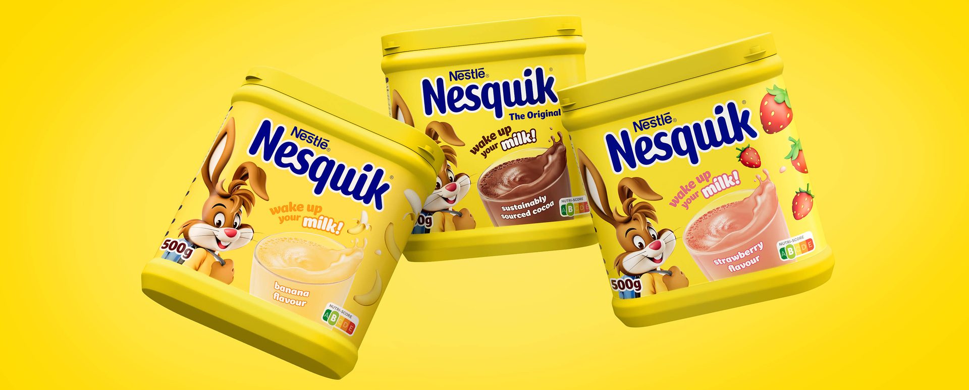
NESQUIK Embarks on New Packaging Journey with help of FutureBrand
NESQUIK has partnered with global brand-led business transformation company FutureBrand to deliver a modern brand identity which will boost brand relevancy and enable growth into new audience segments. At the heart of the work sits NESQUIK’s much-loved iconic mascot, Quicky, who has been reimagined for a digital future. With a focus on purpose and relevance, FutureBrand has created a brand world which will prime NESQUIK for future product innovation and communication, whilst retaining existing audiences.
At the heart of the work is Quicky, the much-loved rabbit with whom generations have grown up. FutureBrand looked to the phygital world that the next generation play in for inspiration, drawing on cues from computer animation films and the gaming industry to bring contemporary relevance and real longevity. This digital-first and motion-led Quicky still feels as familiar as ever and retains his buoyant sense of fun. Immense detail went into his development, ensuring he was a dynamic mascot through his outfits, postures and appearance.
FutureBrand also created a bespoke typeface called NESQUIK Sans, with the aesthetic reflecting the brand's playful and fun personality. This personality was the inspiration for the new logo too, with the animated milk splash bringing it to life in a digital-first world. The new packaging for NESQUIK is bold, immediate and has a real presence on the shelf, with a simplified packaging design system ensuring easy consumer navigation and allowing NESQUIK the opportunity to amplify its iconicity once again.