Lay’s Debuts Largest Global Brand Refresh in Nearly a Century

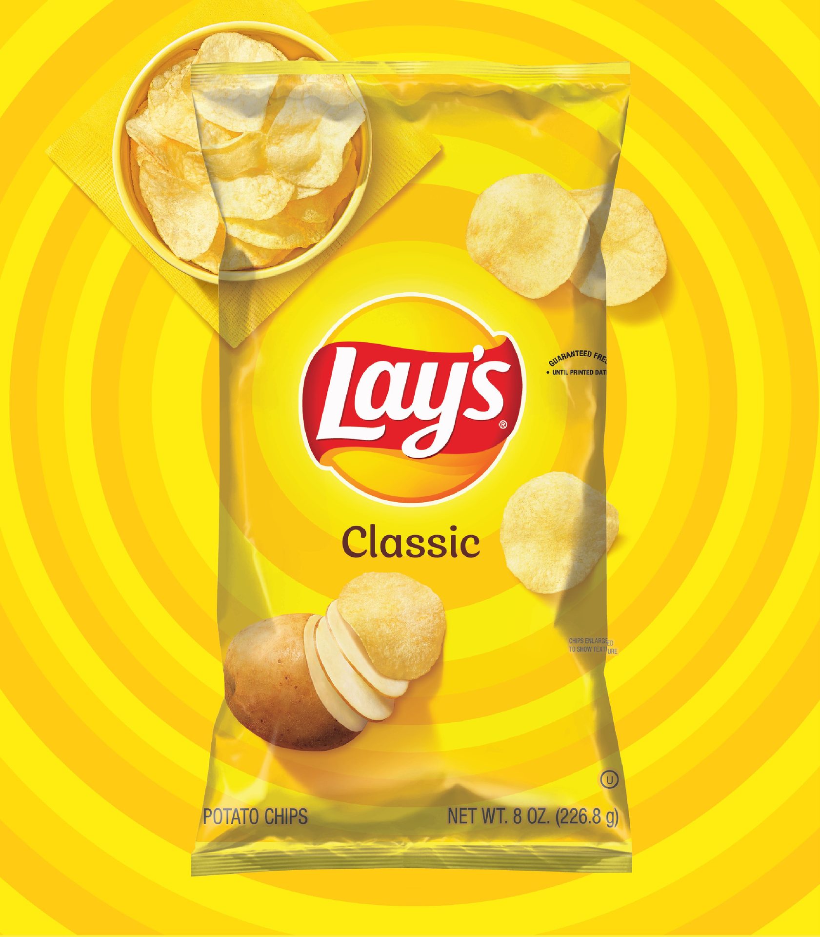
BEFORE
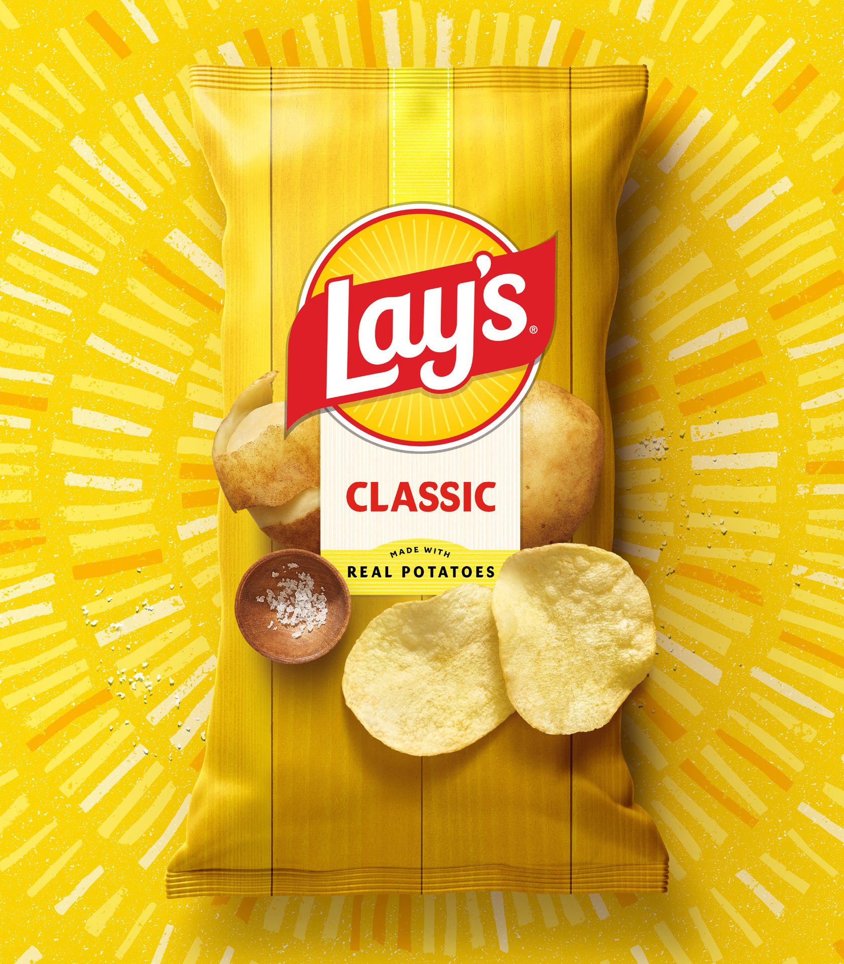
AFTER
Courtesy of PepsiCo
PepsiCo has announced that Lay’s is unveiling its most significant global brand transformation in nearly a century with a new visual identity and packaging that will roll out globally.
“More than just a brand redesign, the new Lay’s visual identity, created by PepsiCo’s Design & Innovation team, now tells a story that speaks to its legacy of authenticity while honoring the potatoes’ journey from farm to bag, its commitment to using only quality ingredients, and the unmatched taste and flavor that people know and love,” PepsiCo says.
While the Lay’s logo has always featured a yellow sun, the team made the sun warmer and more distinct. Sun rays, or “Lay’s Rays,” beam from the logo, a nod to the light that helps potatoes grow.
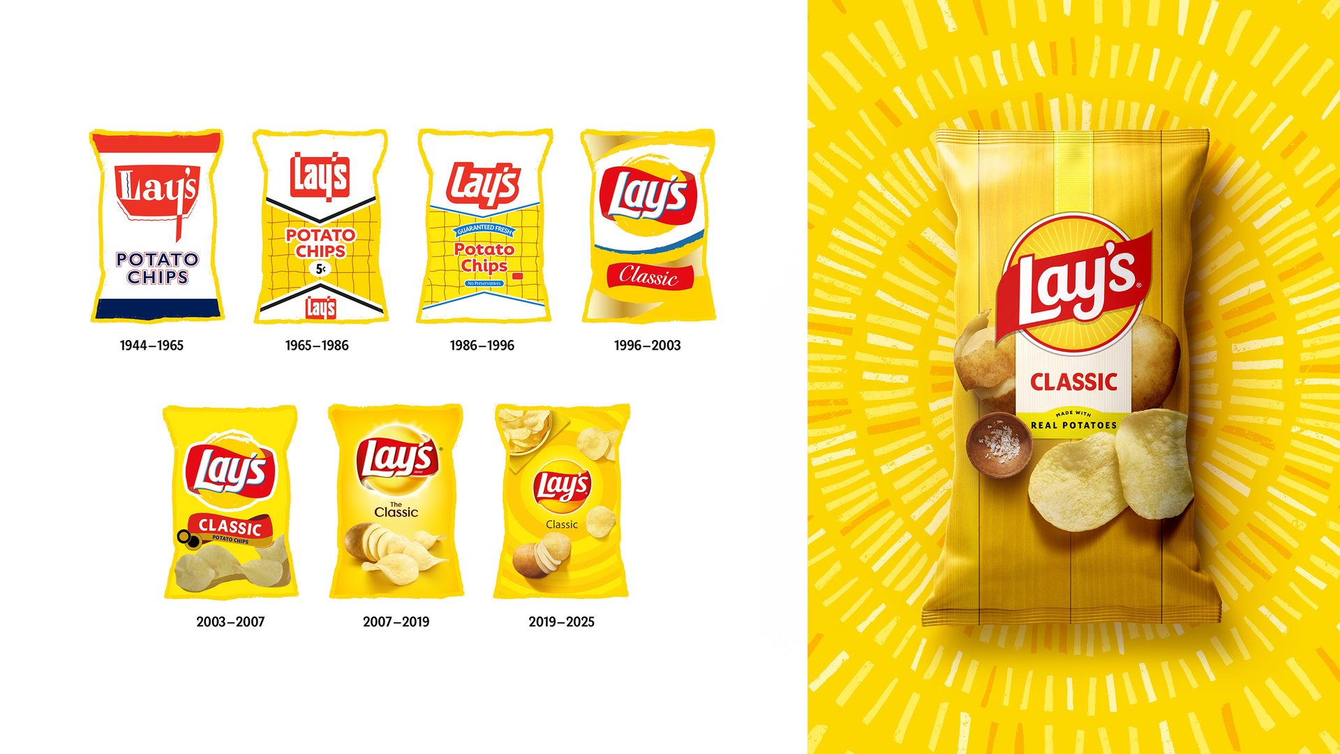
The evolution of Lay’s packaging.
Courtesy of PepsiCo
Updated design elements that are ushering in the next era of Lay’s include:
- Lay’s Rays: The beams of light exuding from the Lay’s logo — known as Lay’s Rays — bring focus and energy to the heart of the new visual identity, paying homage to the sun that powers the quality ingredients inside every bag. Some rays, like those that appear on retail displays, advertisements, and more, were handmade using a potato stamping process, speaking to the brand’s core ingredient and offering natural texture and energy.
- Typeface: “The debut of a new custom typeface perfectly pairs with the iconic logo. Designed to echo the Lay’s modern yet joyful character, the handcrafted type unifies every touchpoint and drives the bold new visual identity forward,” PepsiCo says.
- Color palette: In addition to Lay’s signature sunny yellow, a refined color palette pulls hues from the ingredients of Lay’s recipes, including pickle green, hickory brown, savory red, and more.
- Backdrop: In the pack’s backdrop, the potato and other ingredients are positioned against wood grain slats, a nod to the farm crates that house Lay’s ingredients and the picnic tables where bags are often shared and enjoyed by friends and families.
- Chip Imagery: Against this inviting backdrop, enhanced photography showcases the quality and flavor of every Lay’s variety. Vivid, close-up visuals highlight the golden color, crisp texture, and seasoning of each chip, celebrating Lay’s quality from farm to shareable moment. “Even the flavor panel feels hand-applied, reinforcing the care behind every bag,” PepsiCo notes.
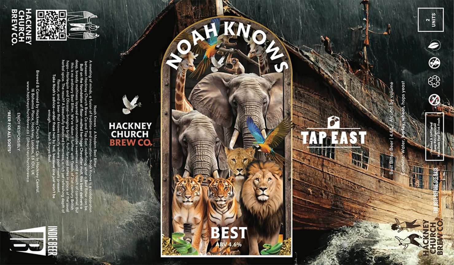
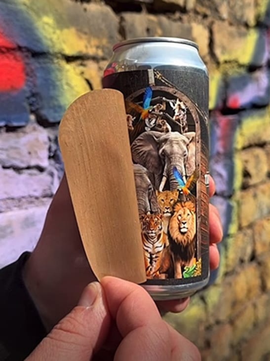
Brewery Adopts Peel-and-Reveal Beer Label with Domino’s Help
UK-based label converter Labelnet and Hackney Church Brewery have joined forces to produce a peel-and-reveal label on a Domino N610i label press.
The ‘Noah Knows Best’ beer label has not only captivated consumers but also been recognized with the DLP ‘Excellence with Hybrid Printing’ Award, celebrating standout label design and print using a combination of two or more complementary digital and flexo processes.
Courtesy of Domino
“The initial impact of the label is excellent and eye-catching,” noted the judges. “This is further enhanced by the inner label peel-off door to reveal the print underneath, with the added detail of the double-sided print of the door peel to create the full ensemble. An impressive hybrid print winner.”
Labelnet’s award-winning labels were produced on two layers of white polypropylene, combining printing on their 5-color, roll-to-roll Domino N610i digital label press with offline lamination and adhesive kill on an Edale FL3, with a heavily textured varnish applied on an ABG Digicon providing the finishing touch.
Rob Lorkins, MD, Labelnet, explains: “We were able to create a concept for this label by combining our customer’s inventive and alluring branding and bringing it to life with the print quality and resolution that the Domino N610i delivers in abundance. This press has been a source of reliability for us and has taken us to the next level as a business by constantly providing solutions. It is no surprise that the N610i was the foundation for our first DLP Awards win.”
The N610i roll-to-roll press is based on Domino’s proven Generation 6 digital label printing technology, which has almost 350 installations worldwide. The print engine is also available as an Integration Module for incorporation into a flexo printing press, enabling converters to combine digital printing at 600dpi with analogue printing and finishing to create eye-catching labels in a single pass.
To learn more about Domino’s N610i digital label press, visit https://dmnoprnt.com/2p94pxxn.
Courtesy of Domino
Courtesy of Domino
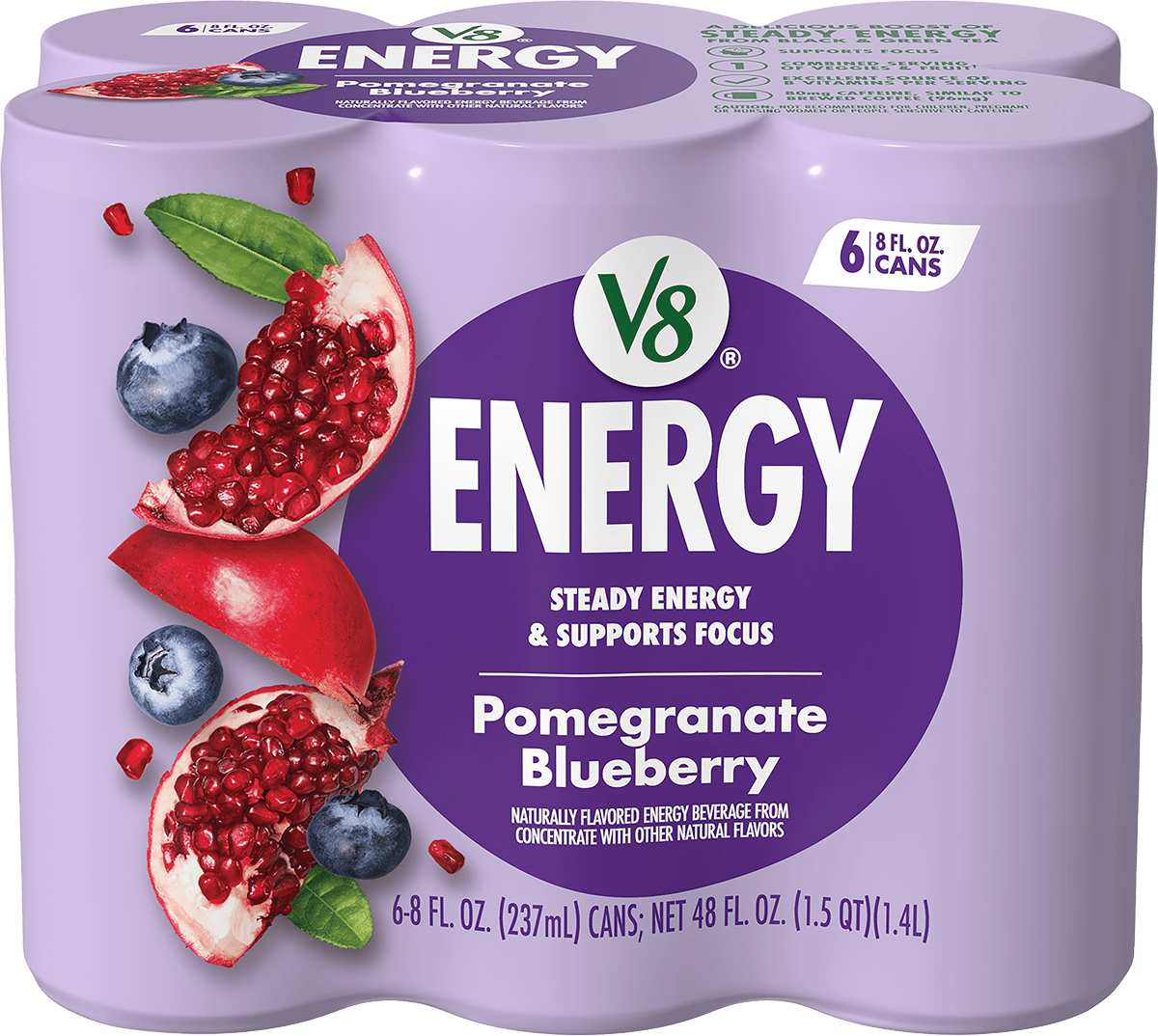
V8 Energy Launches Fully Redesigned Packaging
V8 Energy is turning a new page with freshly redesigned packaging. The brand is redefining how energy drinks can look on the shelf while staying true to its commitment to better-for-you flavor and function.
The new design introduces:
- Modern, bold visuals that clearly communicate flavor and functionality
- Clean, streamlined typography for easier shelf readability
- Color-coded flavor cues to quickly guide consumers
- Packaging that reflects the active, health-conscious lifestyle of today’s energy drink buyer
“V8 Energy refreshed its branding and packaging to better align with consumers’ expectations for a better-for-you energy drink that delivers steady energy and supports focus. The redesign highlights the brand’s delicious, fruit-forward flavors with bold colors and mouthwatering fruit imagery, while also reinforcing key product benefits through easy-to-navigate icons,” said Cory Brooks, Senior Design Manager at The Campbell’s Company. “By leveraging its in-house design team, V8 Energy evolved the graphics to feel more modern, flavorful, and impactful — both on shelf and online.”
This refresh is not just about aesthetics; it’s about connecting with a broader flavor and function seeking audience while maintaining the trusted V8 Energy essence that is helping people pour energy into what matters most.
Courtesy of V8 Energy