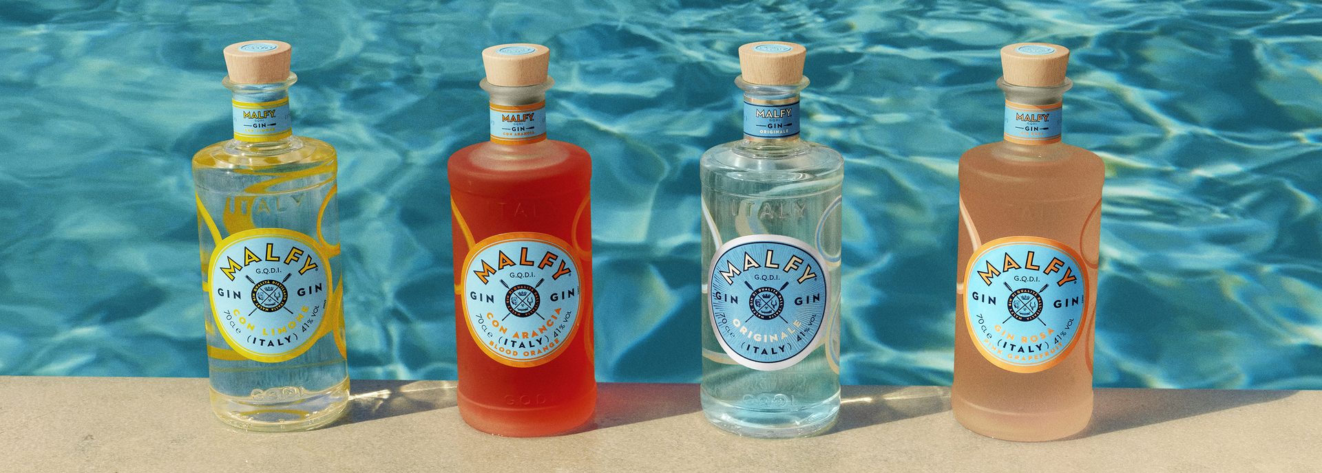
Malfy Unveils New Bottle Design for its Malfy Originale Dry Gin

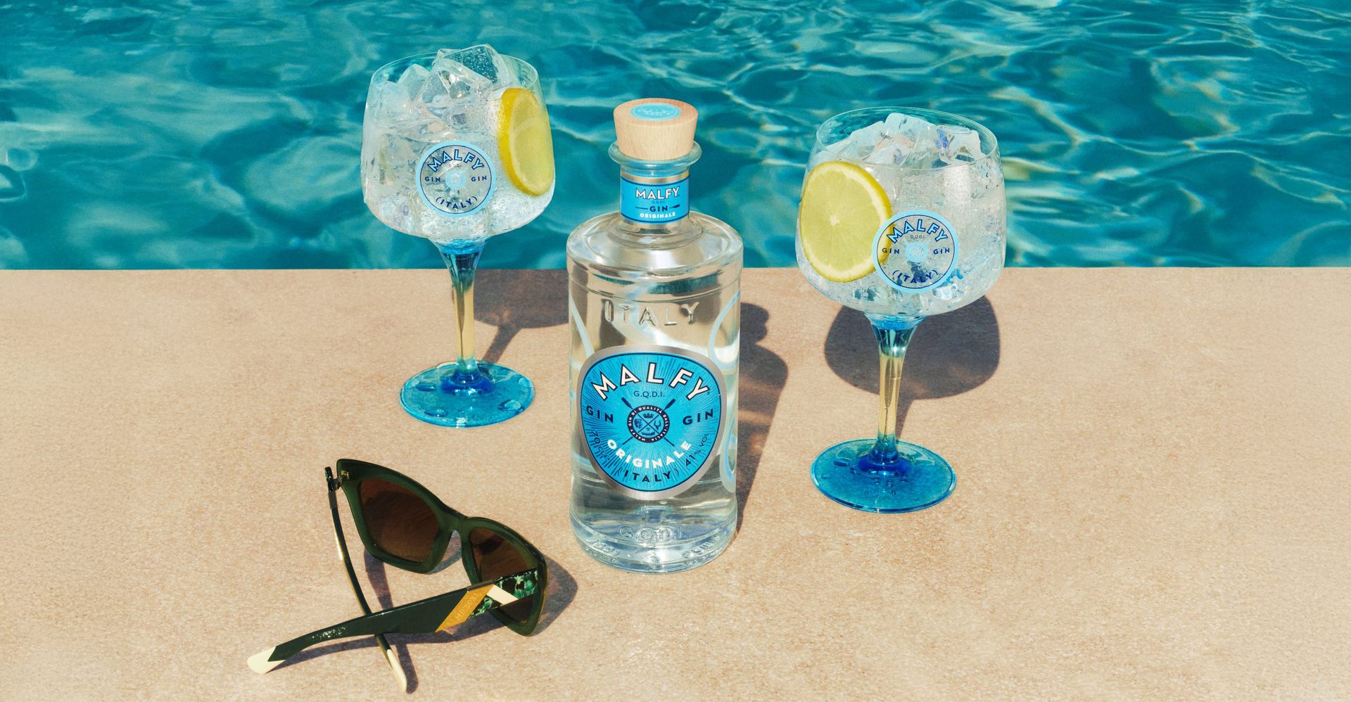
Malfy has unveiled a stunning new bottle design for Malfy Originale, its classic dry gin with an Italian twist, aiming to strengthen the brand’s position in the growing super-premium dry gin category.
The mesmerizing new look of the bottle pays homage to Malfy’s home country of Italy and is inspired by the breathtaking Amalfi Coast. Echoing Italy’s sun-drenched coastline and shimmering blue sea, the new design sets the mood for gatherings that feel elevated and effortless, encapsulating the feeling of being on Italy’s luxurious coast.
Every detail of the new bottle exudes Italian allure and sophistication. While retaining the core elements of Malfy’s unique style, the new bottle, draped in a shimmering silver and vivid turquoise design, dials up its premium quality with bold design elements. It features a frosted ring that wraps the glass bottle, accompanied by a new sunburst textured graphic in a magnifying turquoise tone for enhanced logo visibility, positioned prominently on the front. The neck collar mirrors the new logo with its eye-catching color scheme and refreshed silver foil border.
The new bottle was designed with the help of Nude Brand Creation.
Product images courtesy of Malfy Originale
Murielle Dessenis, VP Marketing Global Gins, comments: “Malfy Gin has been on a wonderful trajectory of growth becoming the number one Italian super premium gin in recent years, not only growing footprint in Flavors but in the Dry segment, too. Our multi-award winning Malfy Originale Dry Gin will be a key contributor to growth in the future, and we are thrilled to unveil our new bottle design inspired by the shimmering turquoise sea of the Amalfi Coast, epitomizing Italian allure to be even more desirable and stylish, resonating with our consumers.”
The new bottle design developed in collaboration with Nude design agency will help elevate and strengthen the brand’s position in the super-premium dry gin category. The design has been validated by consumers for its strong associations with premium, elegance, and style.
Gold Bar Whiskey and Joe Montana Launch First-Ever Canned Cocktail Collaboration
Gold Bar Whiskey, the Official Whiskey of the San Francisco 49ers, has announced the release of its first-ever ready-to-drink cocktail in collaboration with legendary Hall of Fame quarterback Joe Montana — the Gold Bar Whiskey ‘Double Gold’.
This bold twist on a whiskey mule, made with premium Gold Bar Whiskey, ginger, lime, and a splash of orange juice, delivers a smooth yet strong 8% ABV kick — just the way Joe likes it.
Every thoughtfully designed 12oz can of Double Gold features a unique QR code unlocking a complimentary vintage Joe Montana T-shirt, designed as a bold tribute to a true legend. Fans can #ScanTheCan and visit the Gold Bar Distillery on Treasure Island to claim their exclusive shirt, turning every sip into a collectible moment.
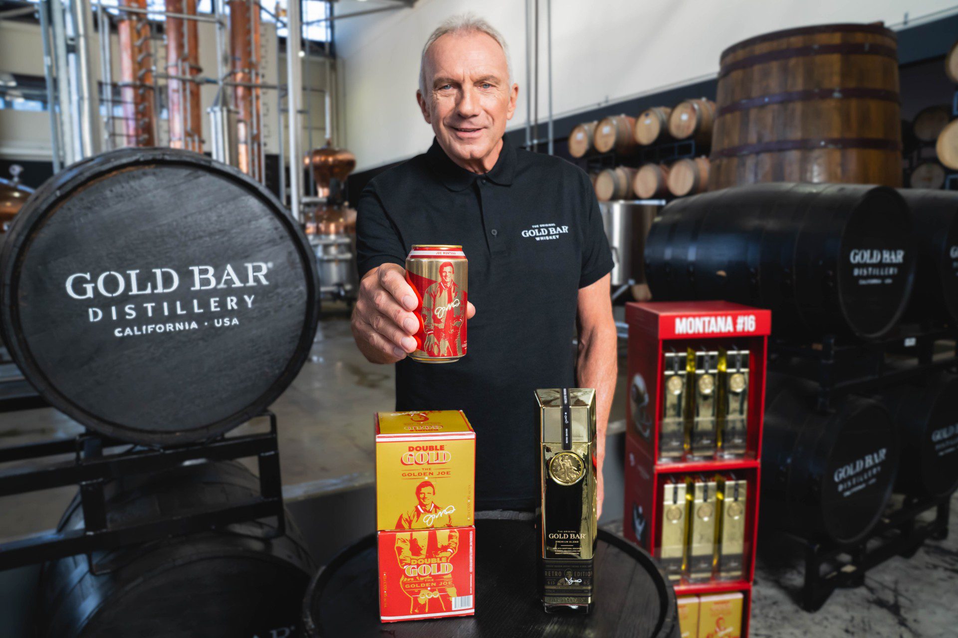
Each can of Double Gold features a QR code that consumers can scan to unlock a complimentary vintage Joe Montana T-shirt.
Courtesy of Gold Bar Whiskey
To commemorate the 40th anniversary of the 49ers’ historic 1985 championship, Gold Bar Whiskey is also releasing a Retro Edition 85-proof straight bourbon finished in wine casks.
Each bottle comes with an innovative “Necker Koozie” — a detachable drink sleeve designed to keep Double Gold canned cocktails ice cold. The design draws inspiration from the iconic gold satin jackets worn by Joe Montana and the 49ers in the 1980s, reviving a vintage throwback look that’s deeply embedded in Bay Area sports history.
“The craftsmanship poured into Double Gold and Retro Edition exemplifies the dedication and passion from the Gold Bar Whiskey team,” Montana said. “I look forward to seeing fellow whiskey enthusiasts and football fans enjoy these products as much as I do.”
The Double Gold is now available at retailers across Northern California and nationwide delivery at goldbarwhiskey.com. The Gold Bar Whiskey Retro Edition bottle launched in stores and online last month.
The launch of these two new products marks a major milestone for Gold Bar Whiskey as it blends its award-winning craftsmanship with Montana’s iconic legacy, kicking off a multi-faceted marketing campaign inspired by vintage 49ers nostalgia. As San Francisco prepares to host the Big Game in 2026, Gold Bar Whiskey is setting the stage with this dual product release, paying homage to Montana’s championship legacy while rallying fans for the football season ahead.
Green Mountain Gringo Unveils Brand Redesign for Salsa and Tortilla Strips
Green Mountain Gringo, makers of all-natural salsas and tortilla strips in Winston-Salem, NC, has arrived in stores with a bold new look for its line of award-winning salsas and a robust new marketing program around the theme, “Let’s Gringo!”
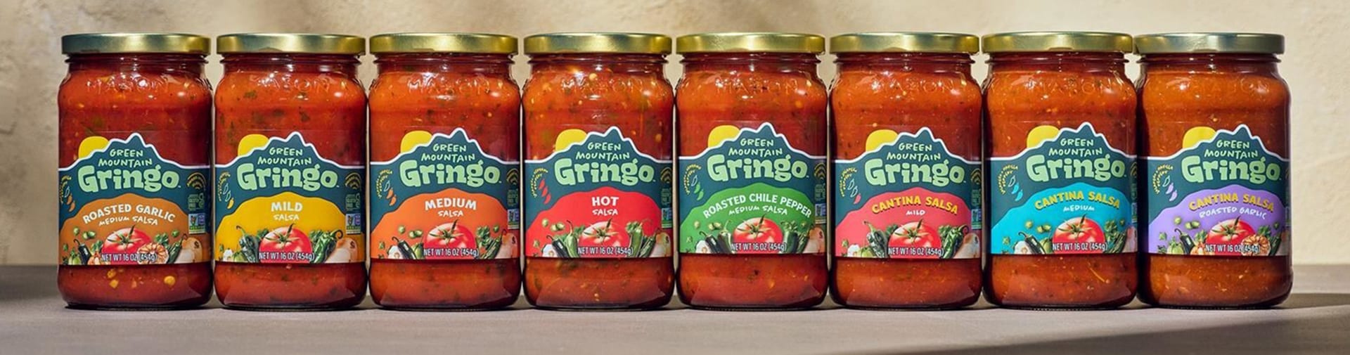
Green Mountain Gringo used vibrant colors and images of fresh vegetables to create an eye-catching new design.
Courtesy of Green Mountain Gringo
“Green Mountain Gringo has a rich history of crafting salsas with clean, simple ingredients and bold, vibrant flavors,” said Director of Marketing, Katie Chaffin, for Garner Foods, parent company of Green Mountain Gringo. “Our new brand look, website, and marketing campaign, celebrate what makes Green Mountain Gringo special: vegetables picked at the peak of ripeness blended with rich spices to bring excitement to your taste buds.”
The comprehensive rebranding campaign created by marketing agency, Wildfire in Winston-Salem, includes a packaging refresh for all of the salsas and strips, new in-store and sales materials, an enlivened website, and an advertising/media plan that uses traditional media, digital, social media and influencer marketing tactics.
Sold in more than 2,600 stores nationwide, initially, customers will see the brand’s new look on the salsas and in-store materials, and on the tortilla strips’ packaging in the fall.
Bold colors and fresh vegetables burst forward in the designs to tempt customers’ palates. “Our salsas have always delivered a bright, robust, flavor with just the right kick, and that hasn’t changed,” added Chaffin. “With the new bold packaging, we’re making sure the outside matches what’s inside. It’s a fresh look for a brand that’s always been about keeping things simple. We’re excited for it to stand out on the shelves the way our salsa stands out on the table.”