
Package of the Month
Agency This Way Up Creates Packaging for Nurishh
This Way Up, a London-based design agency specializing in better-for-you food and beverages, has created the branding and packaging for “flexitarian”-focused new plant-based cheese range, Nurishh.
In 2020, Groupe Bel acquired All in Foods, a French plant-based cheese startup, with the aim to develop a globally recognized plant-based cheese profile that appealed to mainstream and flexitarian audiences.
Groupe Bel reached out to This Way Up following the agency’s success designing for healthier food and drink brands like Danone and Marmite.
Rather than focusing on the vegan market, Groupe Bel and This Way Up sought to create a brand with wide appeal. Following global brand analysis into the category, This Way Up identified their key audience as “agile home heroes” — essentially parents of teens or carers looking to feed the entire family with the one meal that everyone would enjoy.
TWU worked with Groupe Bel to name the range and landed on Nurishh to create an ownable brand (thanks to the spelling) and its implications of “goodness,” notions of family and the suggestion of the attributes of the product itself.
Central to the agency’s initial strategic work was “semiotic mapping” of how health and taste are communicated through design. This Way Up says it sees “health and taste as being not mutually exclusive,” and that approach helped to inform the design language used across all Nurishh touchpoints.
“The designs needed to strongly communicate taste, which was a massive barrier in the vegan cheese market,” says This Way Up designer Beth Kelsall. “Nothing in the plant-based cheese category was shouting about taste or color. This opened up a space to create a design which was full of color, eye-catching and appealing for everyone.”
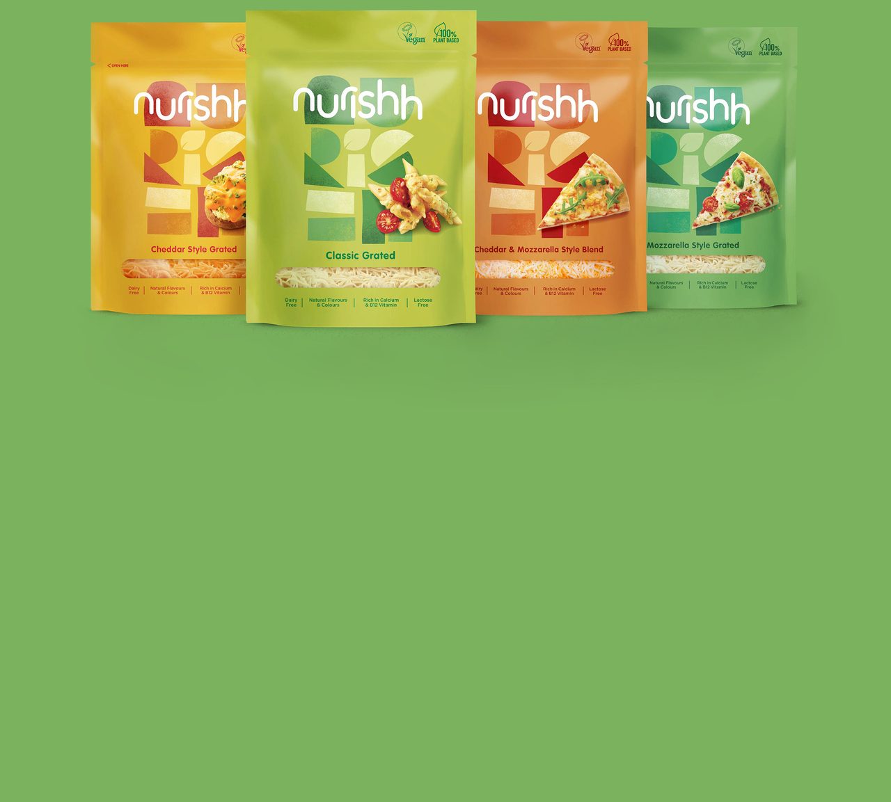
Nurishh, as both product and brand, breaks with the conventions of vegan cheese — often packaged either as facsimiles of its dairy cousins or with neutral, unremarkable aesthetics that play up to its connotations of restricted diets. Instead, Nurishh’s packs use bright, cheerful colors, playful type, Bauhaus-like modular forms, and on-pack photography that dials up taste cues.
The Nurishh logotype is set in all lowercase, and this wordmark is used alongside more experiential, illustrative lettering formed of simple shapes. “These abstract shapes represent Nurishh’s mission to bring everyone together. All food needs and cravings are fulfilled with Nurishh,” says Kelsall.
Stacked and condensed versions of the logo illustrate how the brand overall was created to be flexible across varying touchpoints from digital to print. “As a product, Nurishh makes plant-based cheese accessible and inclusive, and the brand reflects this,” says This Way Up’s Chris White. “Accessibility and inclusivity have been the building blocks of creating a brand experience — both in real life and online — that welcomes our agile home heroes fully into the fold.”
Courtesy of This Way Up Agency
ADVERTISEMENT

Target Adds Pet Food Brand to Private Label Lineup
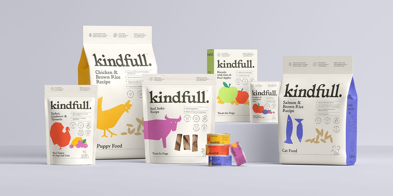
More than a year in the making, Kindfull is the retailer’s new cat and dog food private brand.
Kindfull includes an assortment of wet and dry food, treats and toppers includes delectable items like Chicken & Brown Rice Recipe Dry Dog Food, Wild Caught Salmon Recipe Wet Cat Food, and Chicken, Pumpkin & Turmeric Recipe Toppers.
In 2020, more families than ever before welcomed new pets. The majority of Target guests are pet parents, and they want high-quality pet food at a great value. So the in-house team got to work with pet food and nutrition experts, diving deep into guest insights to create a line of pet food with no artificial colors, flavors or preservatives and no wheat, corn or soy.
“Kindfull highlights Target’s continued commitment to providing our guests with an incredible cross-category portfolio of owned brand options to choose from alongside their favorite national brands,” says Jill Sando, executive vice president and chief merchandising officer, Target. “With Kindfull, our newest owned brand offers guests pet food for their furry family members that showcases our commitment to quality, value and thoughtfully selected ingredients.”
Courtesy of Target Corp.
Häagen-Dazs Scoops Out Playful and Artful Brand Redesign
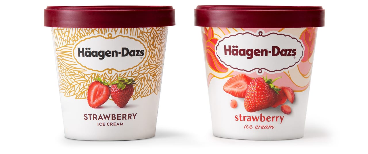
The look of luxury is constantly evolving. So, 60 years after the founders of Häagen-Dazs created the first luxury ice cream that could be enjoyed by all, the Häagen-Dazs brand is redefining how to communicate luxury.
According to Elizabell Marquez, CMO of Dreyer’s Grand Ice Cream, “We recognized that it was time to redefine luxury and evolve with changing consumer needs. Inspired by the creativity and passion of the brand’s founders, we are building on our heritage of bringing luxury to the many, rather than the few. The Chase Design Group team created a stunning design that celebrates the unique and special attributes of our brand.”
The Häagen-Dazs brand tapped Chase Design Group to redesign their iconic packaging, express the evolved brand positioning, and infuse an artful playfulness across the line. According to Ryan Doro, senior designer, Chase Design Group, “Old luxury was all about a minimal, clean, and very organized look. Modern luxury can have a little more personality, rich colors, flowing lines, even a playful energy, and we wanted to fully embrace that.”
The design team paid close attention to the brand’s core equities and values. It refined its signature cartouche logo while retaining the prominent use of white and accents of gold and burgundy. But the background tapestry was transformed into an artful display of color and style. “We expanded the color palette to include an exciting range of bright colors to showcase the depth and breadth of the line,” notes Doro. “Each flavor is adorned with its own unique, hand-illustrated tapestry that adds color, energy and movement to the package.”
Luscious ingredient photography is playfully positioned to enhance the purity and authentic flavor appeal while standing out against the bright range of colors. “We wanted to be sure that the typography also represented modern luxury, so we created a custom font named ‘Dazs’ that retains the classic vibe, but with a modern flair, and paired it with a hand-lettered script,” explains Jon Arriaza, senior design director, Chase Design Group. The combination of the two enhances the feeling of artful and playful.
The brand refresh appears across all facets of marketing from the brand’s visual identity and packaging redesign to other communications led by the Cartwright agency, including TV advertising, digital, social, print, out-of-home and influencer programming. The redesign runs across the entire 80-SKU line and is currently rolling out nationally throughout the summer.
Courtesy of Chase Design Group
Global Design Agency Turner Duckworth Creates New Visual Identity for Icelandic Provisions
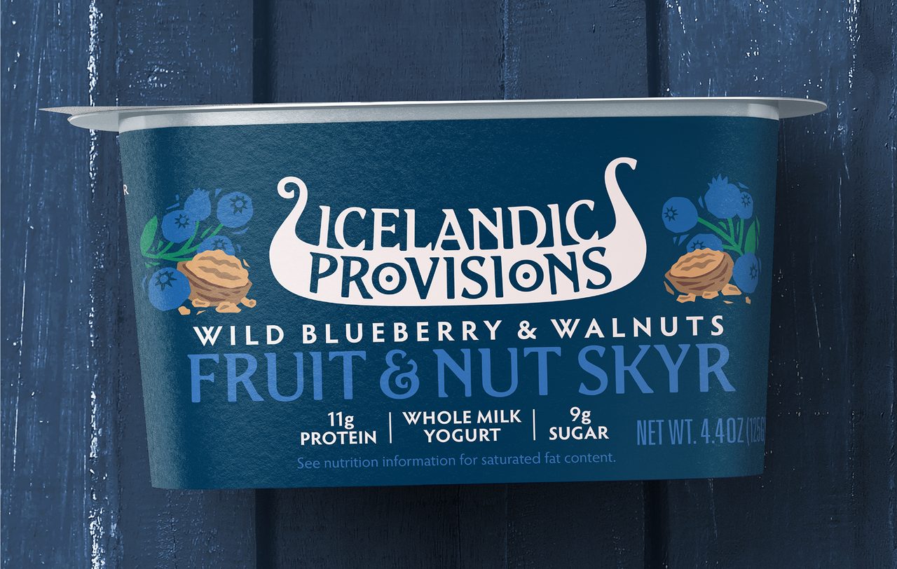
“This rebrand is an opportunity for us to create an iconic expression for our brand; tell the story of Iceland, its values, its provisions, its foods,” says Dan Hickle, Icelandic Provisions’ chief marketing officer. “We want people to really feel the heritage and connect with it in a powerful way. Our Skyr is made with heirloom cultures that stretch back to the age of the Vikings.”
Inspired by this, Turner Duckworth created a new icon for the brand in the form of a Viking longship. "It's one of those great right-brained marks that works at lots of levels,” explains Turner Duckworth Design Director Matt Lurcock, "It's a symbol of strength, and journeys, fitting the brand. The word ‘provisions’ sits neatly in the hull, where provisions would be stored — the 'O's in provisions even gave us two shields to hang from the sides, Viking-style! But the mark also has this smooth, creamy quality, evocative of the Skyr. It's full of great discoveries, which in itself is a very Viking thing.”
Turner Duckworth also created a bespoke typeface, “Edda,” inspired by runes — traditional Icelandic letterforms. The distinctive trailing serifs of these letters echo the forward movement of a ship. The hand-carved style carries through to illustrations of native fruits, berries and nuts.
Lurcock adds, “Icelandic Provisions has a fantastic story, grounded in tradition, but with a strong sense of optimism and progress; and all centered on the food, the Skyr. With the longship icon, the new typeface and the way we depict ingredients, all the chapters of this story are now there, in design.”
Courtesy of Duckworth Design
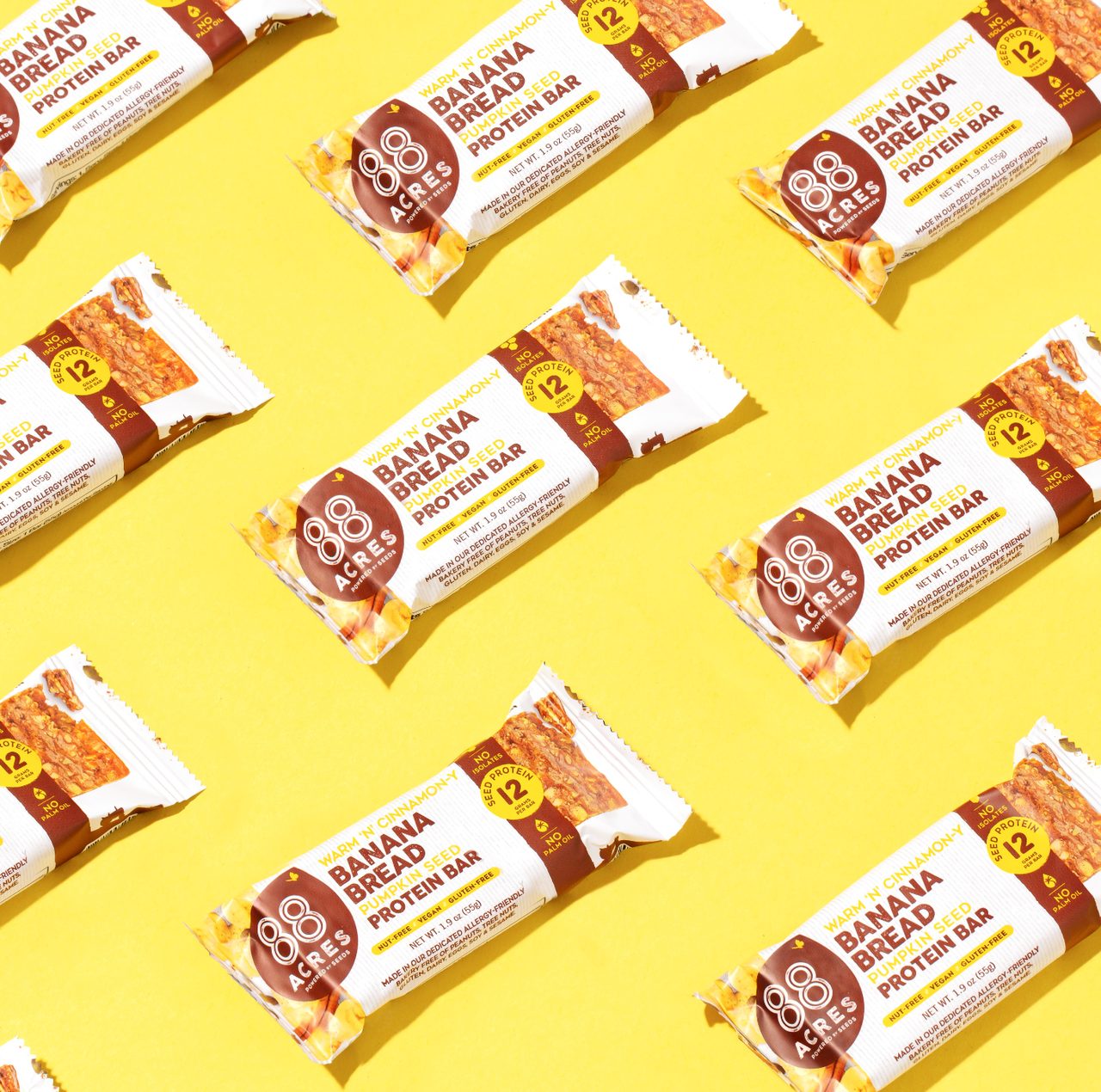
ROOK/NYC Designs New Packaging for 88 Acres
Six years after launching their seed-based, allergy-friendly snack company in 2015, co-founders and wife/husband duo, Nicole Ledoux and Rob Dalton, saw the opportunity to evolve and elevate their brand’s identity and packaging design to adapt to rapidly changing culture and consumer behavior. The team at 88 Acres tapped brand partner of more than three years, ROOK/NYC, to collaborate with on the redesign.
The goal of the project was fourfold: drive taste appeal, set product expectations, educate and drive trial. To drive taste appeal and set product expectations, ROOK/NYC incorporated new ingredients and product photography with the aim of helping consumers quickly understand what the product is made of.
The evolved color palette speaks directly to category flavor cues, while the logo was placed in a seed-shaped holding icon. The new logo design aims to emphasize that seeds are the foundational ingredients with which all of 88 Acres’ products are made.
The language and product descriptors on the packaging is simpler, with a stronger, more playful brand voice that seeks to reflects familiar, tasty, home-cooked terminology.
88 Acres chose to retain both the existing logo and the leading color of each stock keeping unit to maintain brand and flavor recognition for their current, loyal consumer set.
“Through our long-term relationship, the brand has seen enormous growth, despite the economic challenges of 2020, and this redesign will be a big step in helping 88 Acres to grow beyond the natural channel into more of an iconic mainstay in the conventional snacking category,” says Mark Christou, founder and creative partner at ROOK/NYC.
Courtesy of ROOK/NYC